A buddy of ours, Jonathan LeBlanc (@jcleblanc)from PayPal, did a presentation on the Rise of Wearable Technology for us this year during ConvergeSE. Nod (the product) would fit in well to that discussion.
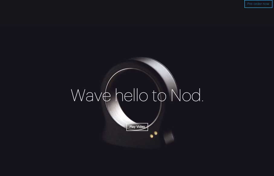
Nod’s website is actually probably as impressive as the device itself. It is simple in design – and yes, that’s a running theme lately in my reviews – but the back-end of the site is not so simple – and that’s good. As you scroll down, notice not only that there is fairly seamless video on the left, but also animation that syncs with the gestures as it displays on the right. To paraphrase Steve Jobs – simple is hard – but it gives you a much better user experience. Nod’s website captures this principle very well.


0 Comments