by Gene Crawford | Apr 24, 2014 | Gallery
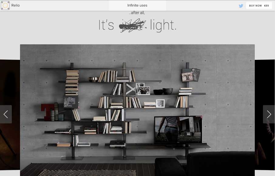
What a nice minimal(ish) design approach. If I were to think about what a site for a company that designs apps/icons this is what i’d hope I’d come up with. Beautiful sections and simplified nav choices make this site super easy and laid back feeling while...

by Gene Crawford | Apr 24, 2014 | Gallery
Pretty crazy presentation here with the video and large “splash” section. I really dig how that transitions into the asymmetrical layout with the photos and how they handle while changing screen widths.

by Gene Crawford | Apr 23, 2014 | Gallery
Nicely done straight forward design. I love the dark color scheme and the tiny animation work. Beautiful design.

by Gene Crawford | Apr 23, 2014 | Gallery
Neat illustrations down the page. I really dig the rhythm of the page too, there are some sections that are “scroll hijacked” but overall I like it. Neat looking contact form area near the bottom of the site too.

by Maria | Apr 22, 2014 | Gallery
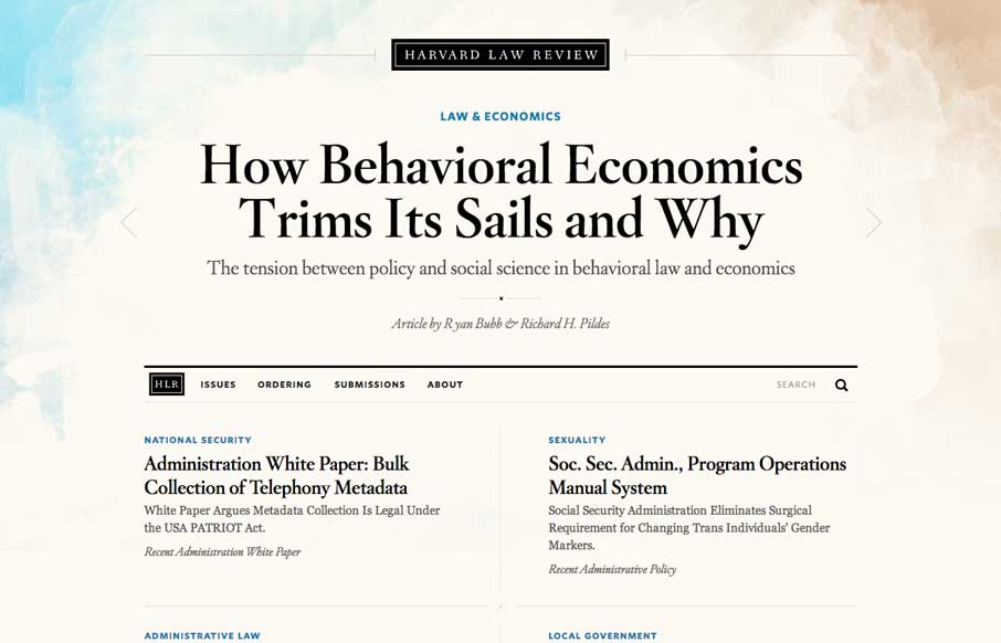
I wasn’t expecting to see something as remotely beautiful as the home page of the new Harvard Law Review site. It’s rich yet lean, and really pushes the limits of typography successfully. The background graphic elements frame the page nicely. It’s curious that...
