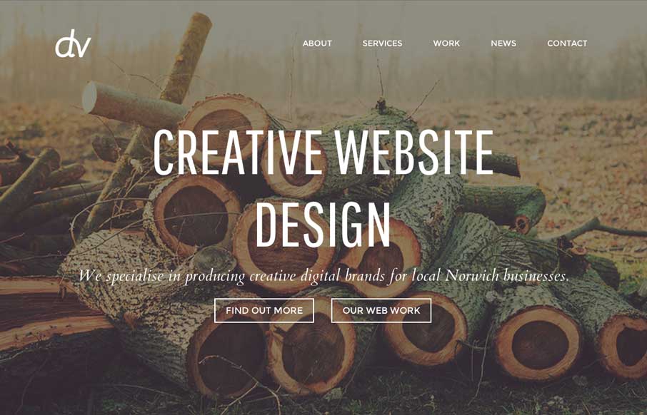
by Gene Crawford | Jun 13, 2014 | Gallery
I like the soft colors and imagery they’ve baked into the design for this site. It’s a theme it looks like, but still I like what they’ve done with it. Submitted by Adam Engledow @design_vibe Simple design with a nice rustic and vintage feel which is...
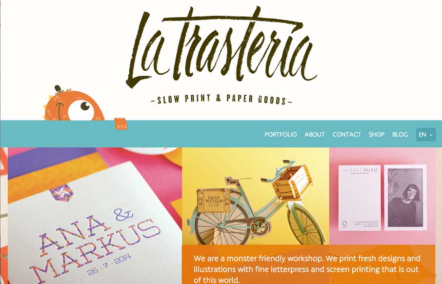
by Maria | Jun 13, 2014 | Gallery, Portfolio
I love the overall feel of this site. It’s crisp yet feels warm and tactile through the use of illustrations, overlays, and pattern. The style of the site matches that of the work which gives a nice cohesion to the brand.
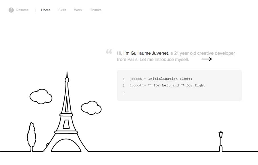
by Gene Crawford | Jun 12, 2014 | Gallery
This site is fun, hands down. I like driving the little robot instead of using the links. Clever and very memorable.
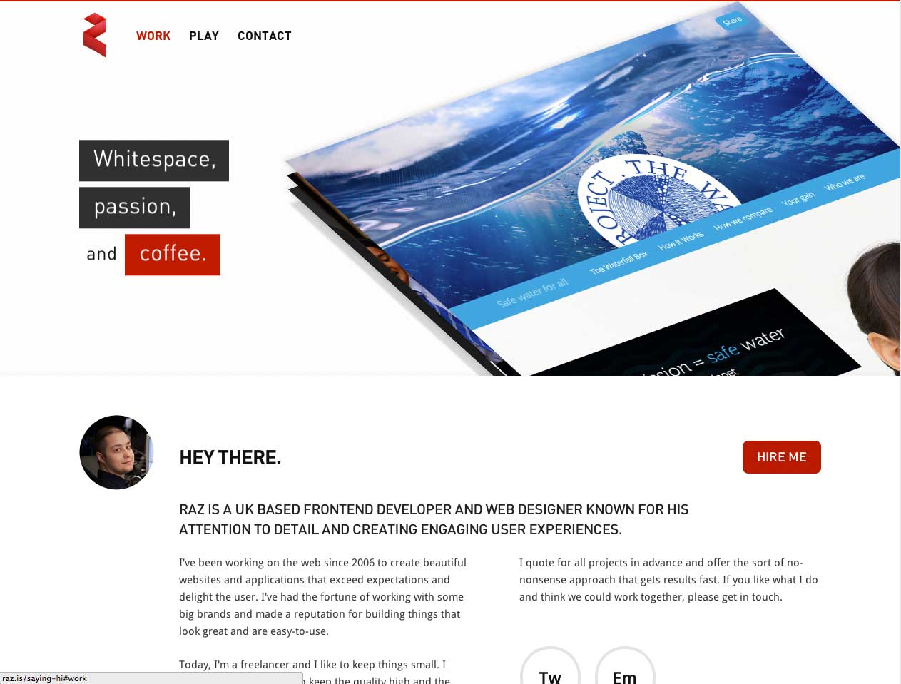
by Gene Crawford | Jun 11, 2014 | Gallery
Crazy interaction on the hero area for the case studies. Lots of other interesting interactions too, check it out when you get a sec. Submitted by: Razvan Cercelaru @raz_c Role: Designer & Developer
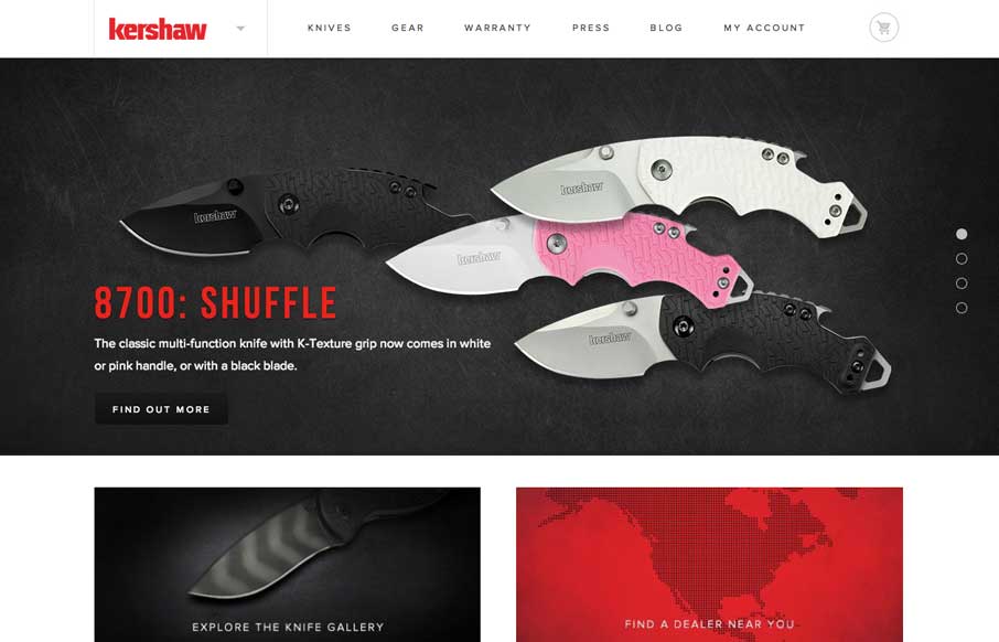
by Gene Crawford | Jun 10, 2014 | Gallery
Nice redesign of the Kershaw Knives website. I love the animations on the hero slideshow area. The rest of the site is well balanced and full of great little details. Also Tomahawk!