
by Gene Crawford | Jun 17, 2014 | Gallery
Some neat graphics here. The three headed lion monster is pretty badass. I like the bold colors, but some of it is over the top. That said however, why not? Submitted by Sunny Rathod @trionn_design
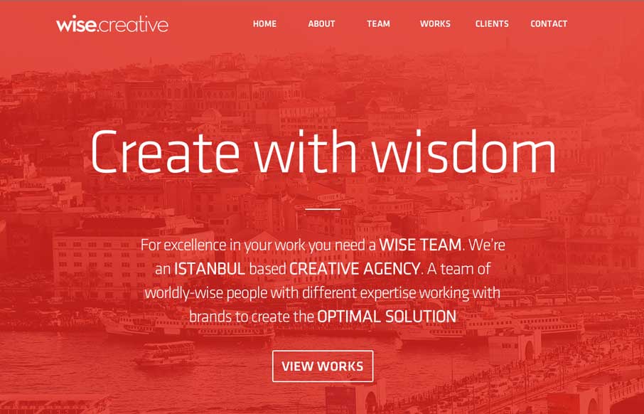
by Gene Crawford | Jun 17, 2014 | Gallery
I always like to see how people handle the fixed nav animation as you scroll design piece. Wise Creative is one of my favs too. I like the overall clean layout of the site as well. Classic color combo red, black and white too.
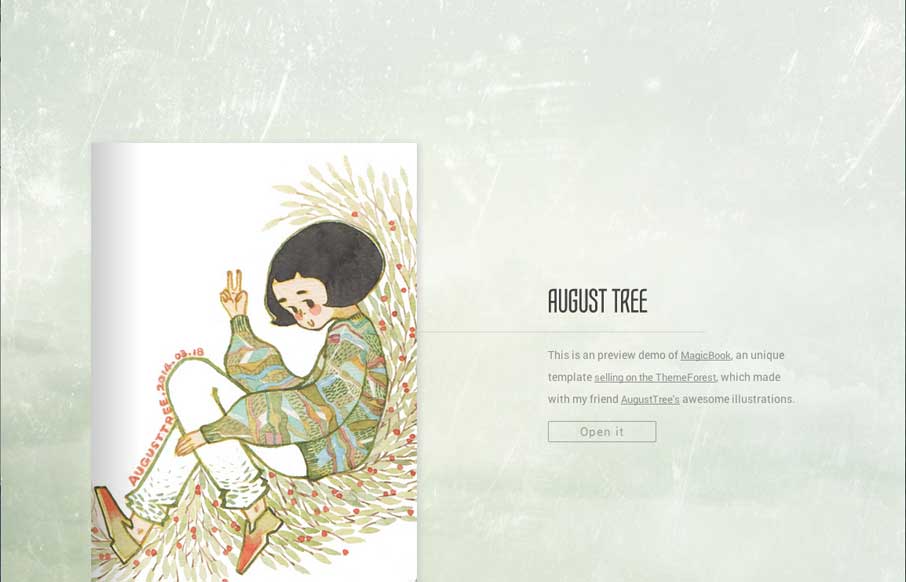
by Gene Crawford | Jun 16, 2014 | Gallery
This is a theme you can buy – in fact it’s a site that is meant to show off the theme. It’s pretty nifty. I’ve actually had clients in the past ask for this specifically and we’ve never built one out, too bad this wasn’t out then,...
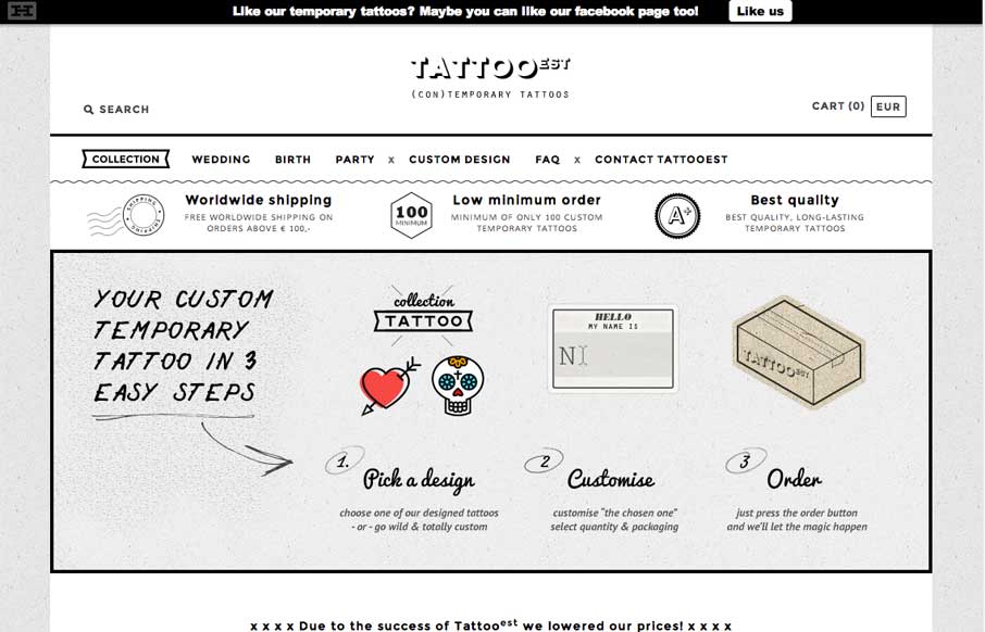
by Gene Crawford | Jun 16, 2014 | Gallery
Nice pure simple black and white site. Clean layout and some nifty illustrations make this site one that I like.
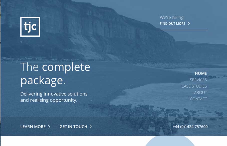
by Gene Crawford | Jun 16, 2014 | Gallery
I dig the clean layout and nice use of negative space between text/design elements on this page. The minimal color palette is very business too, with the blues.