
by Aaron Griswold | Jun 27, 2014 | Gallery
Do you remember Yahoo Stores? I had a local client a couple of years ago that I had to move their store from Yahoo Stores, to a different platform. Forget the three databases of information that I had to parse through to get one inventory number, to then match up with...
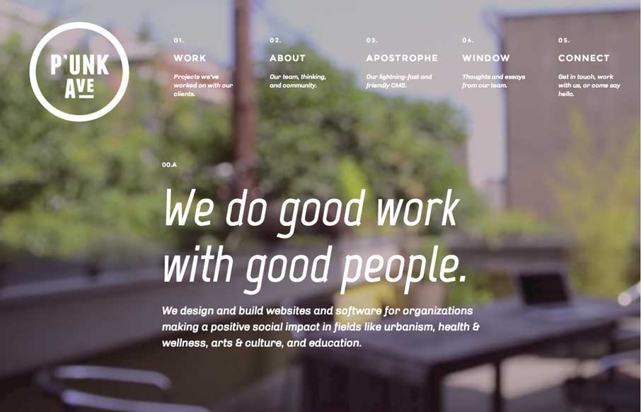
by Aaron Griswold | Jun 26, 2014 | Gallery
So two things I really like about P’unk Ave’s website: First is the video background. What many sites are doing right now is using the video background to show more about their companies / products – but then you kind of get lost in the video, and...

by Maria | Jun 25, 2014 | Gallery
This site is gorgeous. It’s oozing with details that exceed any home builder site that I’ve ever seen. The photography is stunning, the typography is on point, the restraint in use of space feels so right. It’s as distinctive as the neighborhoods and...
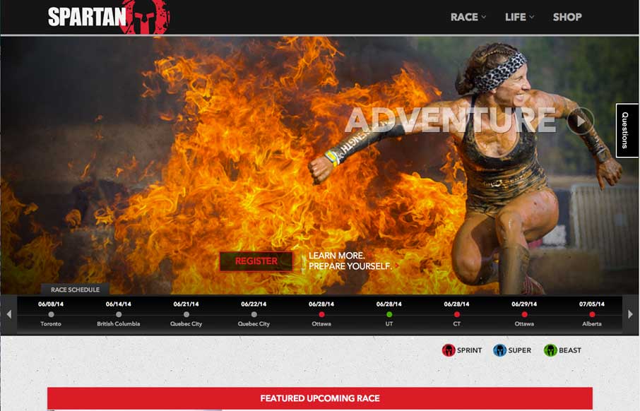
by Aaron Griswold | Jun 24, 2014 | Gallery, Sports/Recreation
So the Unmatched Style Wrecking Crew just signed up for our second Spartan Race yesterday. We signed up for The Beast – which is the toughest race we’ve done yet: 12+ miles, 25+ obstacles – most of them involving mud. We have 17 weeks 3 days and 10...

by Gene Crawford | Jun 24, 2014 | Gallery
Learn Git, have fun. I love the page design. Great little illustration work and a solid layout and graphics to boot. Go learn it, now. Submitted by: Fabricio Rosa Marques @fabric_8 Role: Designer We launched our new project “Learn Git” today. It’s a...