
by Aaron Griswold | Jul 2, 2014 | Gallery
Awesome use of a subtle parallax slider that fills above the fold. Also, check out the detail pages for the portfolio work – good navigation, and great, clean way of displaying their work.
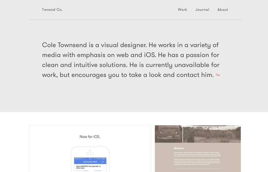
by Gene Crawford | Jul 1, 2014 | Gallery
Minimal or simple is hard to pull off and it’s not often I come across a site design that truly does it well. I dig this site for Cole Townsend, as portfolio sites go this one is a good one to me.
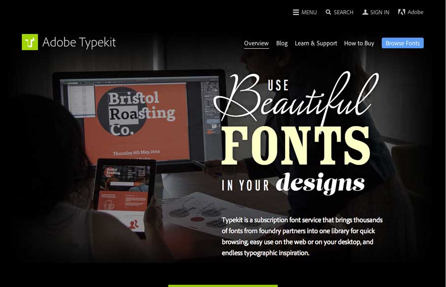
by Gene Crawford | Jul 1, 2014 | Gallery
New Typekit site design. Well new to me, I don’t exactly go to the site all that often since it’s all up in my photoshop and stuff now. Beautifully designed page with the almost asymmetrical feel and the blocks of images and content. It’s responsive...

by Aaron Griswold | Jun 30, 2014 | Gallery, Nonprofit
I imagine that this website had a lot of moving parts to it when AFM was trying to organize it. They struck a good balance of telling stories to get you interested in where and what they are doing (which looks to be a lot), and made sure that their specific calls to...
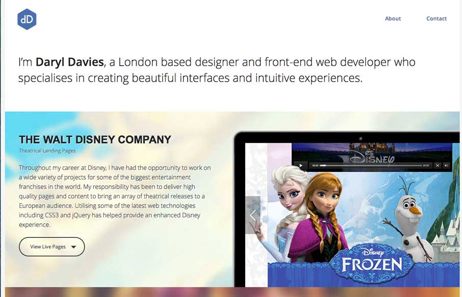
by Aaron Griswold | Jun 27, 2014 | Gallery
Every once in a while, you see a portfolio site and think, “damn… I wish I had that person’s job…” – this week, Daryl Davies is that person for me. Between the work for Disney and VGAMR, you (and my kids for that matter) could...