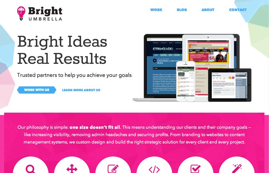
by Gene Crawford | Jul 17, 2014 | Gallery
It’s just simply a well done site. These two have been kicking ass for a long time IMHO and it’s really nice to see them rebrand and launch this company and website like they have. There is plenty to admire about the site design, plenty of detail work, so...
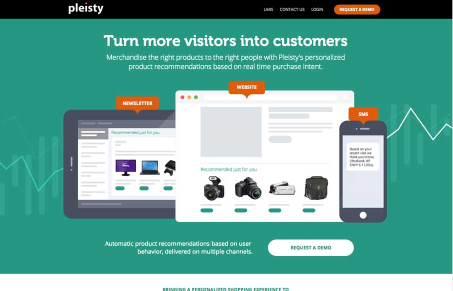
by Gene Crawford | Jul 17, 2014 | Gallery
I love narrative when it’s used in a site design, this one for pleisty is very well done. It’s intriguing and cool looking at the same time. Pretty badass actually.
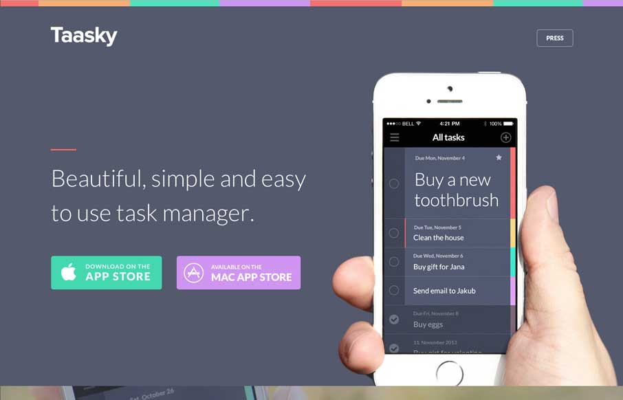
by Gene Crawford | Jul 17, 2014 | Gallery
Really nifty looking design. I like the soft but crisp look to the site, beautiful work. The very bottom/footer of the site is the bestest part though. I can drop them check marks like a pro.
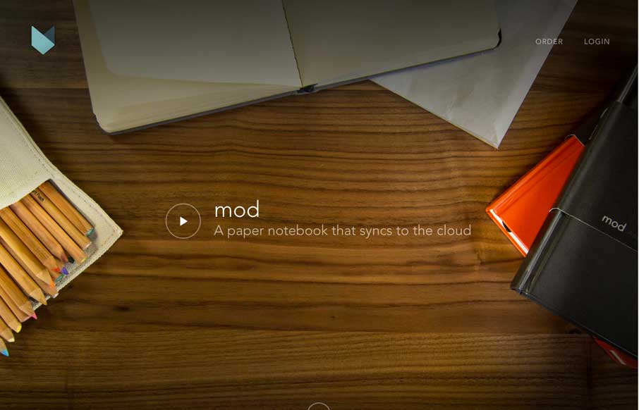
by Gene Crawford | Jul 16, 2014 | Gallery
Aside from the fact that I JUST WANT ONE OF THESE, the site is beautiful. I love the flow of the home page as I scroll and the cart process for ordering is simple and smartly put together. Love the notebook and love the site guys!
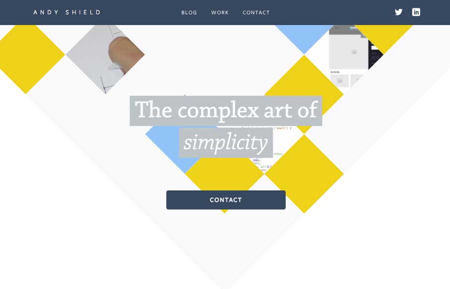
by Aaron Griswold | Jul 15, 2014 | Gallery, Portfolio
If you are going to make a portfolio site for yourself, please make it different from all the other designer portfolio sites out there – and Andy Shield did. Besides not being magenta, he’s made good work of still using trends, but in more subtle ways...