
by Aaron Griswold | Jul 21, 2014 | Gallery
This was a fully responsive redesign of the Twelve South eCommerce website. Twelve South creates beautifully designed accessories exclusively for Apple computers. We love their BookBook for iPhones and iPads – and the site reflects the beautiful design of their...
by Gene Crawford | Jul 21, 2014 | Gallery
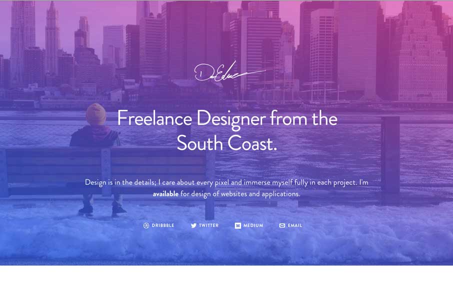
I love the big screenshots, they keep going forever. Pretty cool vibe color wise too, nice stuff. Simple and effective. Submitted by: Dan Edwards @de Role: Designer & Developer I’ve not touched code in years, so to try something new I set myself the...
by Gene Crawford | Jul 21, 2014 | Gallery
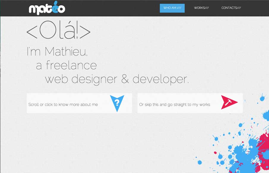
I dig the feel of this site, the two big calls to action “more about me” and “check out my work” that’s pretty much what the site is for and he goes for it in an interesting way with those CTA’s. Other little cool details make the...
by Gene Crawford | Jul 18, 2014 | Gallery, Travel
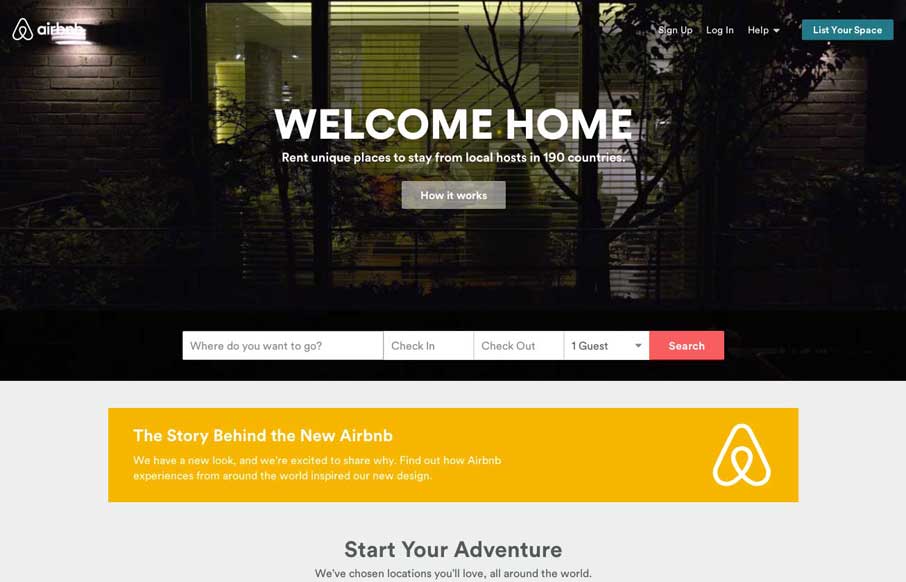
New airbnb website update. Plenty to gawk at, most noticeable is the new branding. Go consume folks!
by Gene Crawford | Jul 18, 2014 | Gallery
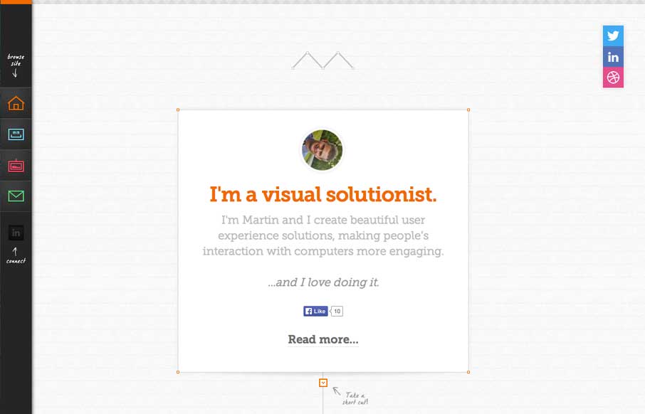
Pretty cool side bar nav design. I also really dig the way the main page is put together with the lines/graph paper feel and the trail connecting things. It’s intriguing enough to make me scroll it and check it all out.