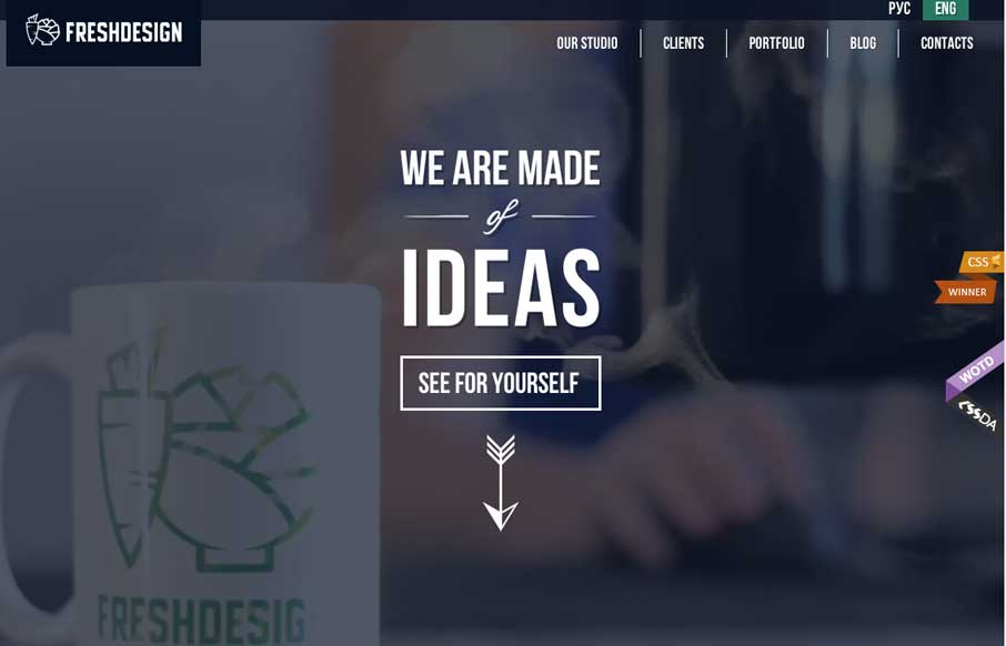
by Aaron Griswold | Jul 14, 2014 | Gallery
There is so much going on in this site (which is a good thing in this case) – from video background, to animated infographics, to maps with carrots growing out of them – you get the idea that this agency has enough skill to make your website pretty darn...
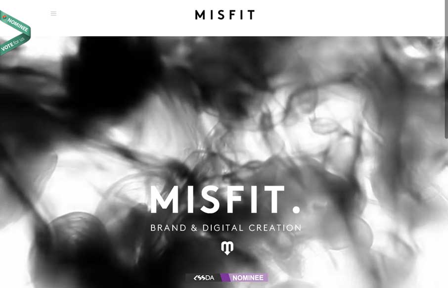
by Aaron Griswold | Jul 11, 2014 | Gallery
I almost don’t have to write a review on this one – Pete Brady (below) really captures the site – black and white with the color coming from the work Misfit does. He forgot to mention the thing that draws you to the site in the first place –...
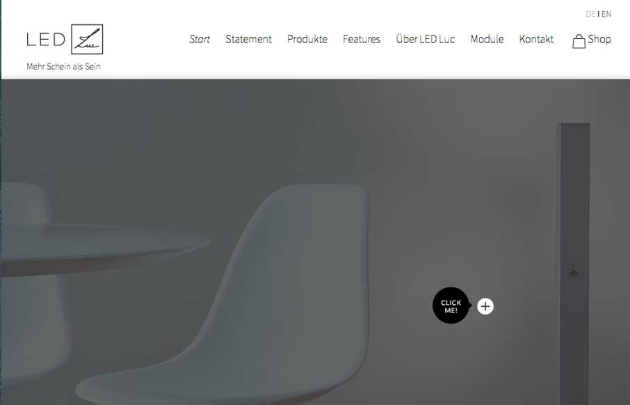
by Aaron Griswold | Jul 11, 2014 | Gallery
LED Luc does a good job of showing off their products in an aesthetically pleasing way – that mirrors their aesthetically pleasing lighting products. I try not to translate pages into English at first, to see if I get what the website is trying to relay or sell...
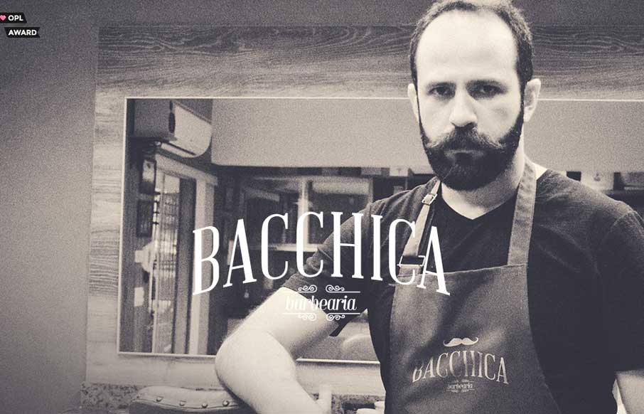
by Aaron Griswold | Jul 10, 2014 | Gallery
Today is taking on a distinctly Brazilian theme with reviews (unintentionally – even though the World Cup ends this weekend). I do not pretend to speak this language, the language that permeates our industry, the language of beards… but I can appreciate a...
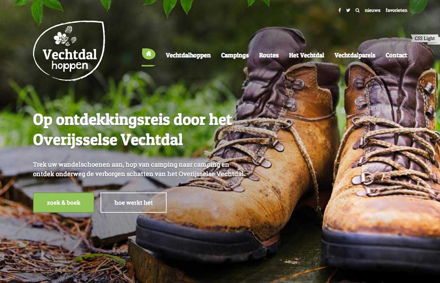
by Aaron Griswold | Jul 9, 2014 | Gallery
Really like the big background image to start out the site – hiking boots may not be your thing, but sets the tone for the rest of the site. It’s a good showcase of the campsites / experience they have to offer. And I don’t know what is going on in...