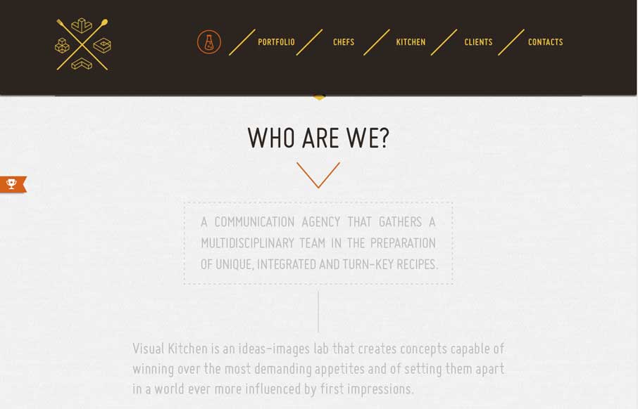
by Aaron Griswold | Jul 24, 2014 | Design Firm, Gallery
We’ve seen a lot of animated gifs – most of them are some crazy cat/dog/weird meme. Luckily, Visual Kitchen uses them to give a little bit of cool expression, coupled with a semi-transparent reveal of content as you scroll down. The drop-down header menu,...
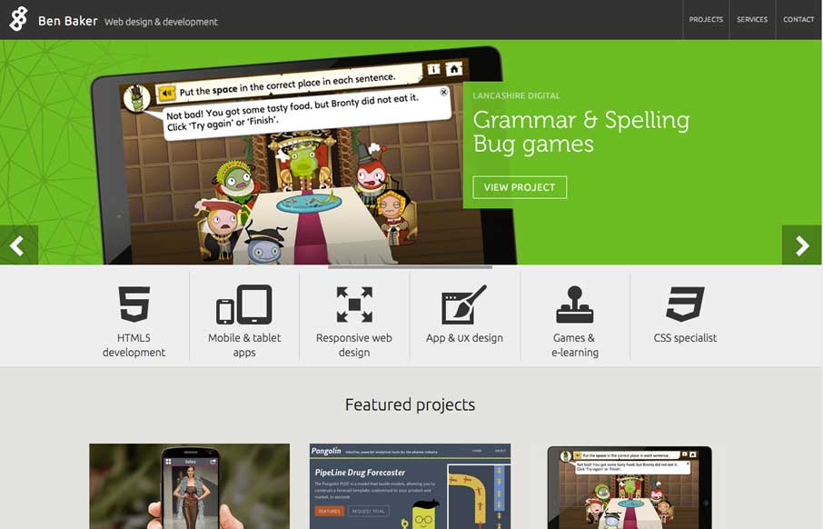
by Aaron Griswold | Jul 23, 2014 | Gallery
Good portfolio site from Ben Baker. Two things to really note – like how the icons fly in when you hover over the navigation. And the project detail pages have some off-screen navigation in the left top corner to quickly change out which project you’re...
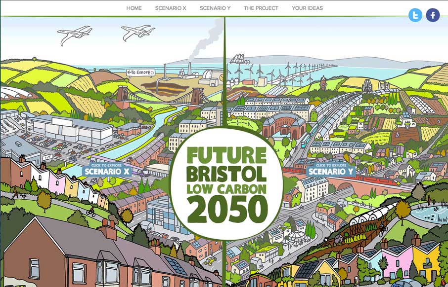
by Aaron Griswold | Jul 23, 2014 | Environment, Gallery
Great way to start your Tuesday – this interactive graphic website on the the future potential of Bristol (UK), that allows users to see the potential scenarios the city may go towards, and vote on the ideas, with real-time feedback on what others have voted on...
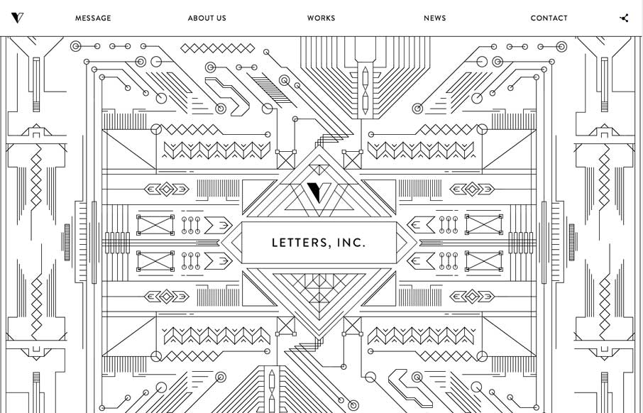
by Aaron Griswold | Jul 22, 2014 | Gallery
At first I didn’t know what to say about this site. What finally comes to mind is “Thank you” – thank you for an awesome site that doesn’t look like every other site and every other agency site. Thank you for having a fun site that really...
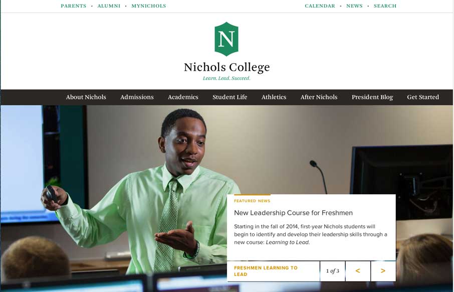
by Aaron Griswold | Jul 22, 2014 | Education, Gallery
College sites are hard, mainly because of all the content from all the different areas that content and data comes from. Nichols College does a good job unifying all of it into a modern, responsive design – that probably looks even better on a tablet view...