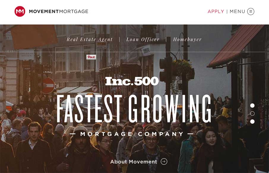
by Aaron Griswold | Mar 18, 2015 | Gallery
Yesterday, we posted a real estate site that broke molds of website design that exist in their industry – today we do the same, with the financial / mortgage industry with Movement Mortgage. As Brittney says below, user experience on most mortgage sites are...

by Aaron Griswold | Mar 12, 2015 | Gallery
You know why we like this site? Besides the fact that it’s a great resource with interviews with some of the best and brightest on the web? We like The Web Ahead site because no one else is really doing this – making a site that’s all about text....
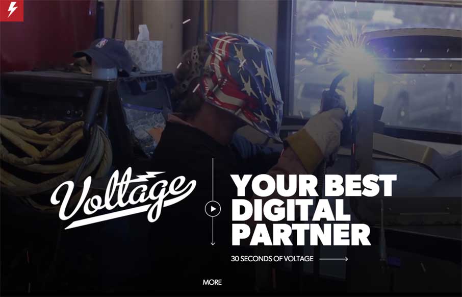
by Aaron Griswold | Mar 11, 2015 | Gallery
Continuing with Reebok day – Voltage, out of Colorado, just worked on the Reebok site we reviewed this morning. When we searched for who did the work – we found their site, and man is it good. The video background and the full-width images – with...
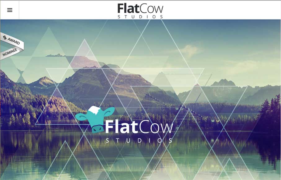
by Aaron Griswold | Mar 10, 2015 | Gallery
I’m not sure if the name Flat Cow is a play on an oxymoron, but design-wise, I like the contrast between the flat design, coupled with robust design – it plays well on this site. Also, the full-width design on the Work page is also pretty cool – and...
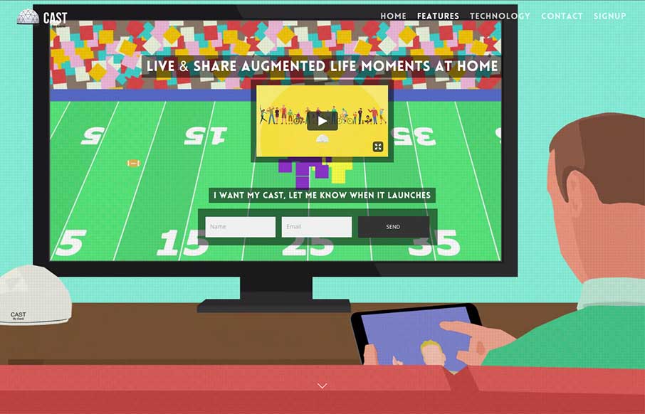
by Aaron Griswold | Mar 10, 2015 | Gallery, Product
Cool new product and website for Cast (by Genii). While I’m not sure who Genii is, I get Cast right away – and the animated video background helps (except for that one dancing dude on the right – reminds me of the Katy Perry Left Shark… but I...