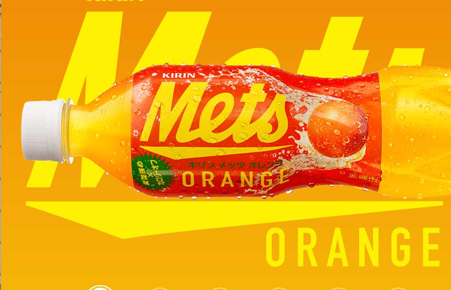
by Aaron Griswold | Mar 5, 2015 | Food and Beverage, Gallery
“We Want Mets – We’re the funky, spunky, younger generation…” is now in my brain for the rest of the day – well played Kirin – well played. I’ve been a fan of Kirin, out of Japan, since before I can legally say. They...
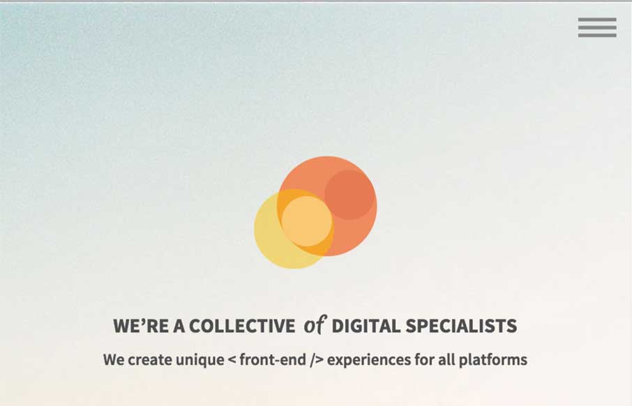
by Gene Crawford | Mar 4, 2015 | Gallery
This Prollective site is a theme, that they made – they note it at the bottom of the page. It’s a pretty dang good looking site and template too, just thought you would enjoy checking out what these guys do with it. We’re a collective of handpicked web...
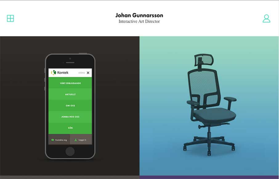
by Gene Crawford | Mar 4, 2015 | Gallery, Portfolio
Something about a classic looking simple design. Johan’s portfolio website has “it”. I dig it greatly! Submitted by: Johan Gunnarsson @nahoj Role: Designer

by Aaron Griswold | Mar 4, 2015 | Design Firm, Gallery
Cool and kind of trippy agency site out of Belgium, from tix02. The scroll is reversed, and the Work section through me off guard for a second; but it’s definitely unique in it’s design, and should stand out to potential clients. I really like the section...

by Aaron Griswold | Mar 3, 2015 | Design Firm, Gallery
I was looking up some information on one our ConvergeSE speakers – Adam Smith – and took a look at his company’s website, a Wilmington, NC based firm – Wide Open Technologies. This is a solid site, that is clean and easy to follow. I especially...