by Gene Crawford | Nov 17, 2015 | Gallery
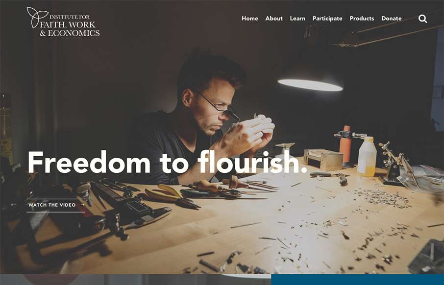
Beautiful design, I love the typography especially. It’s a super long page but the different sections’ design makes you keep scrolling, which is the brilliant part to this design. Then the detail work, like the “time to read” mouse over is so...
by Gene Crawford | Nov 12, 2015 | Gallery, Product, Shopping
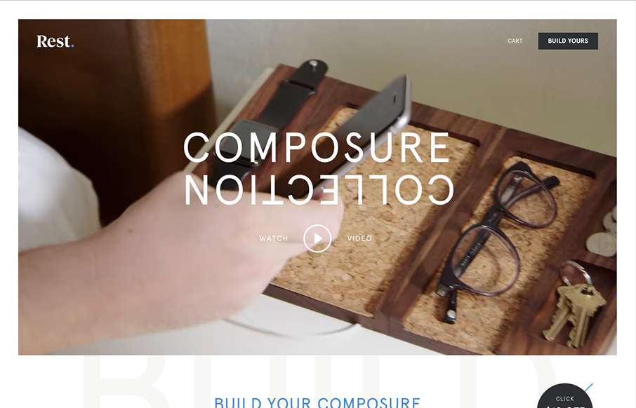
Everything has it’s place. Just like with the product the website for the product has the same vibe and tone. I like the way they show off each different type of product and when you hover over them you can see people’s stuff on it. The website is very...
by Gene Crawford | Nov 12, 2015 | Gallery
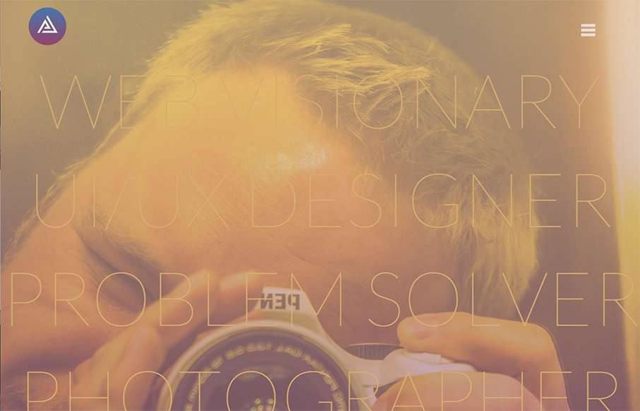
Very thoroughly done website design for this portfolio site. I love the look and feel from top to bottom. The subnav flyaway is pretty cool and I love the “card” part for the work section. Brilliant work.
by Gene Crawford | Nov 11, 2015 | Gallery
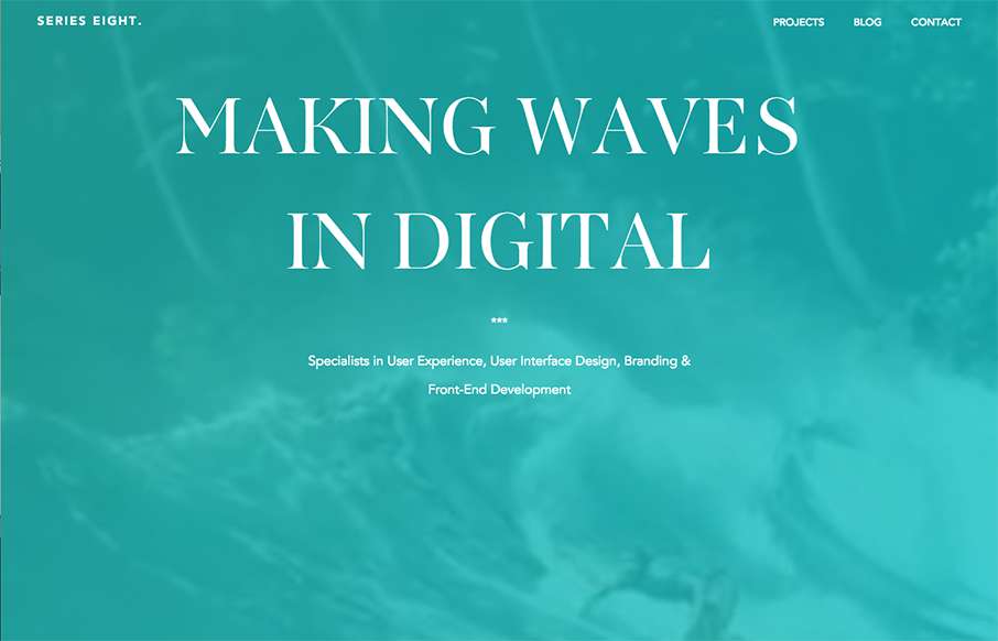
I love the linework and colors used in this design. There is a lot of really interesting interactive details and small animations like the process section that help make this site memorable. They also show plenty of work in the projects section and they show them in...

by Gene Crawford | Nov 11, 2015 | Gallery
I really like this website design. It’s very straightforward and we’ve all seen similar layouts, but they’ve managed to just execute it really cleanly and visually strong. I like the details and the solid approach. Things like spacing and timing are...
