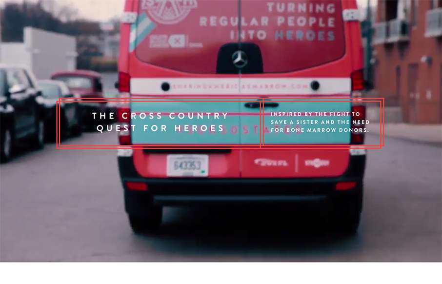
by Gene Crawford | Nov 9, 2015 | Gallery, Nonprofit
The team here at strADegy would go to the worlds end for these three brave and adventurous women. We were honored to help give Sam, Alex, and Taylor the extra help they needed to travel the country and look great doing so. The website was the final piece to the...
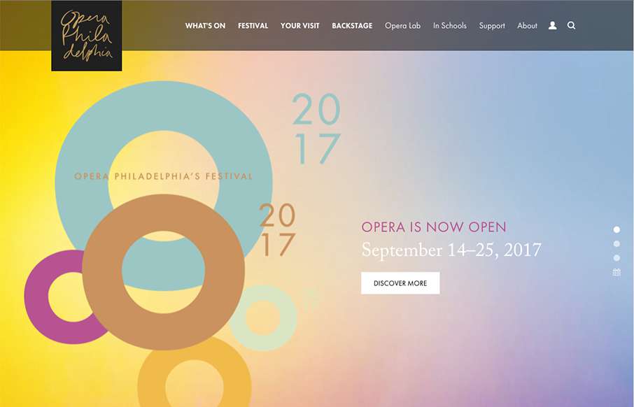
by Gene Crawford | Nov 9, 2015 | Entertainment, Gallery
Beautiful website overall. The single reason i’m reviewing it for the site here is the way they’ve made the main page “slider” most of the home page content as they have. It’s smart and I thoroughly enjoy this idea.
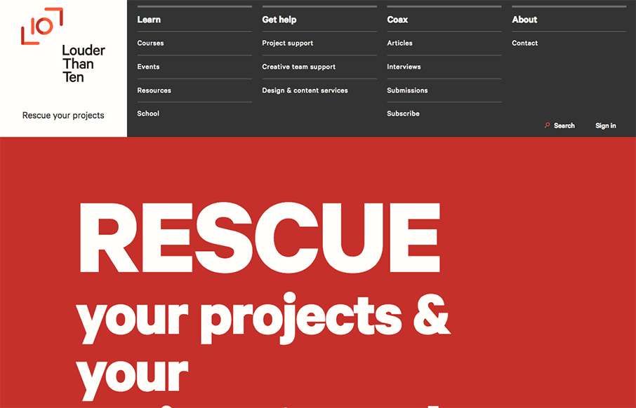
by Gene Crawford | Nov 5, 2015 | Gallery
Louder than Ten, the digital home of Rachel and Travis Gertz, is a wonderfully designed approach to a digital services company website. I love the thoughtfully placed main navigation, including it’s transformation on smaller screen widths, and the large and easy...
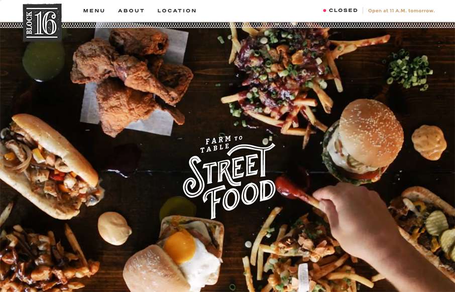
by Aaron Griswold | Nov 4, 2015 | Food and Beverage, Gallery
One more example of how restaurant sites are finally getting facelifts – love this one that Grain & Mortar did for Block 16 out of Omaha, Nebraska. As an aside – restaurant websites have always been horrible (here’s my 2nd site I ever made for a...
by Aaron Griswold | Nov 3, 2015 | Gallery, Product
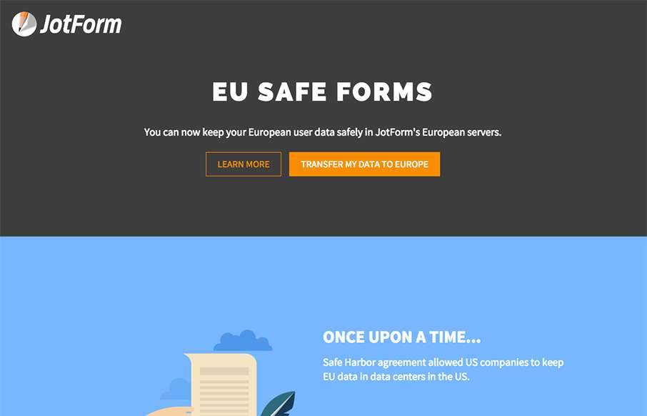
We’re reviewing this page for this page only. It’s a good example of great, clean product (product feature) page – good funnel – good illustrations. (keep in mind that parts of the JotForm site need a good bit of work design-wise – so my...