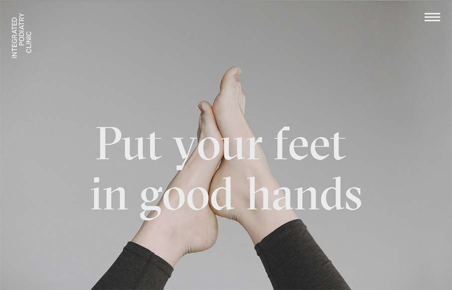
by Gene Crawford | Nov 25, 2015 | Gallery, Medical
Super rad website for a Podiatry clinic. You just don’t see this type of design being brought to client’s like these. Superb work on making something mundane feel really hip and new.

by Gene Crawford | Nov 24, 2015 | Design Firm, Gallery
Nice grid based layout for Firmalt. I like the Masonry like treatment of the main image blocks as you scroll down the page and shift screen sizes. Nice solid simple layout always wins!

by Gene Crawford | Nov 24, 2015 | Gallery
Holy cow I love this. I love the interactions and the pieces that move around as you scroll. It feels quick to respond and looks pretty dang unique too. Definitely a memorable site design. Also, I want to go. 🙂
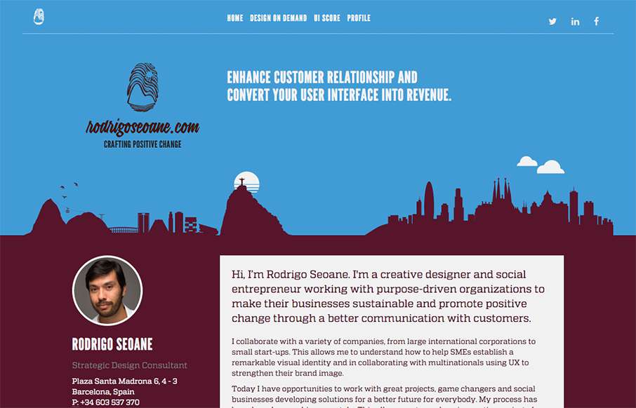
by Gene Crawford | Nov 23, 2015 | Gallery
At first this site design looks fairly classic in its layout. I dig the smaller changes to it in that respect. Some good looking graphic devices to help communicate what he does is smart. I also dig the colors. From the Designer: Hi, I’m Rodrigo Seoane. I’m a...

by Gene Crawford | Nov 23, 2015 | Fashion, Gallery
Some great photography set fixed in the background like this can go a long way for engagement. I also dig the first run animated fade in images down the page. Pretty strong layout. From the Designer: This beautiful site came to be after months of trial and error. We...