
by Aaron Griswold | Dec 1, 2015 | Gallery
Awesome site from This Also out of Brooklyn. Great home page with video background – great use of navigation that is hamburger, but it’s not – and great way of each page always leading back to the home page, but it’s also the footer,...

by Gene Crawford | Dec 1, 2015 | Gallery, Portfolio
Leandro Lima, out of Barcelona has some great work highlighted here – especially the illustration side of the site. I also like the look and motion of the hamburger drawer on the left.
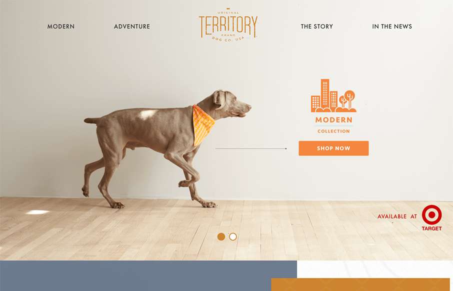
by Gene Crawford | Nov 30, 2015 | Gallery, Shopping
Love the texture that’s woven into this site – both fore- and background, for Original Territory Brand Dog Co out of White Plains, NY. Cool little icon work on the nav too.
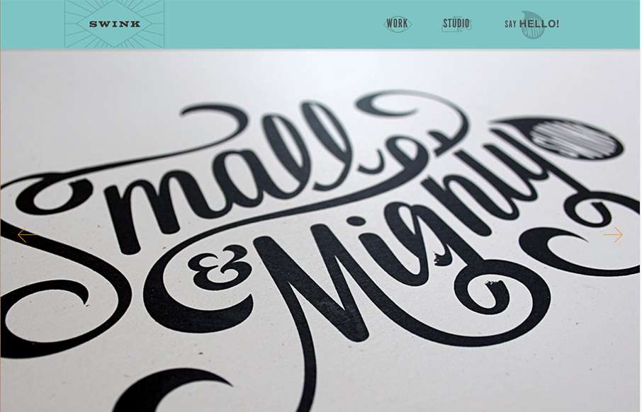
by Gene Crawford | Nov 30, 2015 | Gallery
This studio / agency site for Swink out of Wisconsin is pretty sweet. We’re rebuilding our client services site – and this is great inspiration (we won’t steal, we promise). Love the font work and letterpress style of the site.
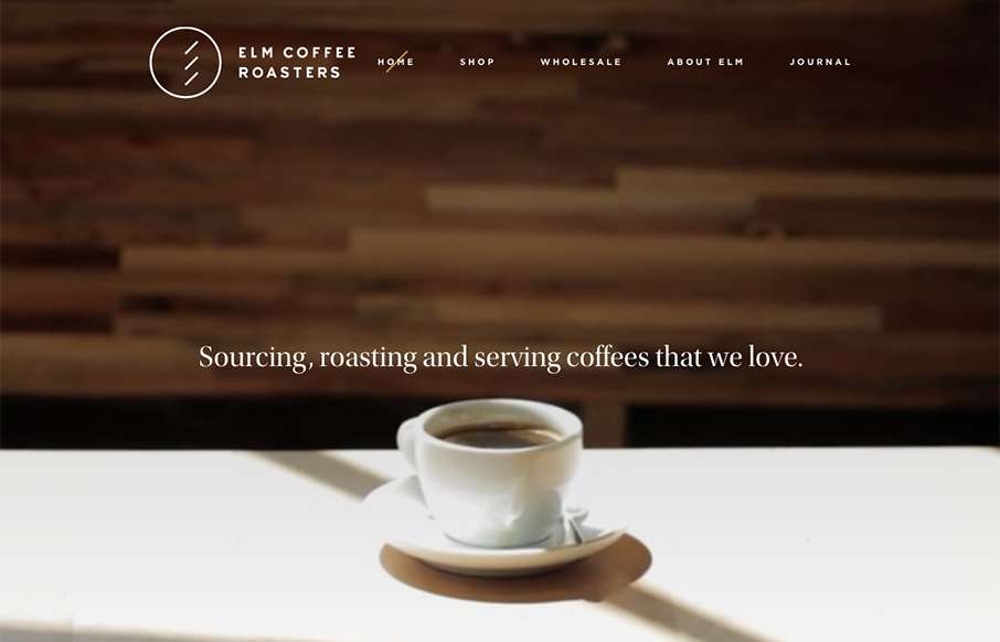
by Gene Crawford | Nov 30, 2015 | Food and Beverage, Gallery
As I was setting up the review for Elm Coffee Roasters out of Seattle – I found myself stopping, and going to get coffee at least twice… I guess the marketing is working. Great design – clean and simple, with video background on top –...