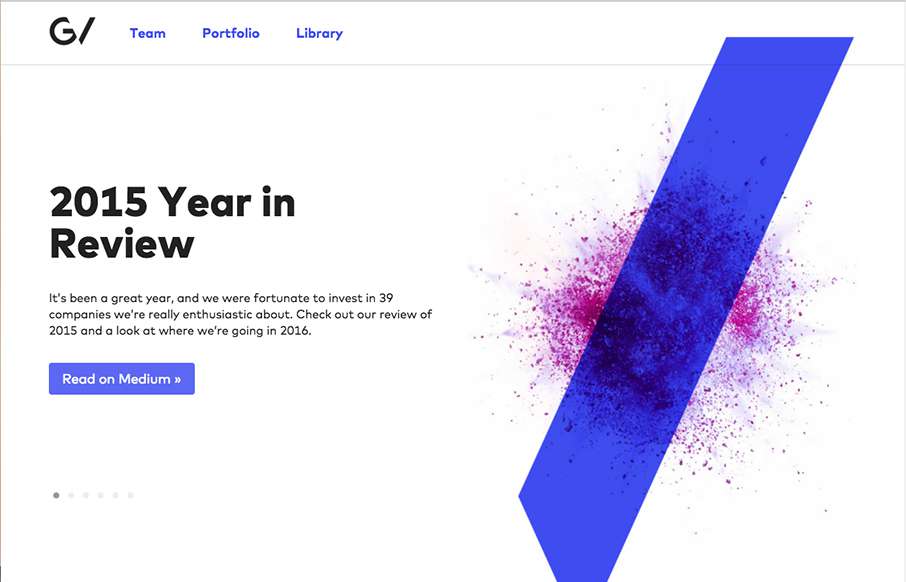
by Gene Crawford | Dec 7, 2015 | Gallery
Another stunning version of the Google Ventures website. I love the slight parallax on the main imagery paired with the overall minimalism. The new logo is quite nice as well.
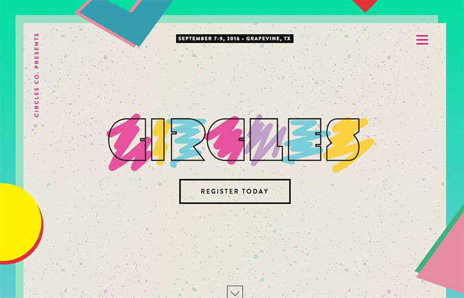
by Aaron Griswold | Dec 3, 2015 | Conference, Gallery
Arrrrgh – it’s killing me – I’ve been trying to figure out / remember for the past two days what album cover that the Circles Conference is pulling their hero image from… at least I think it’s an album cover – I’m...
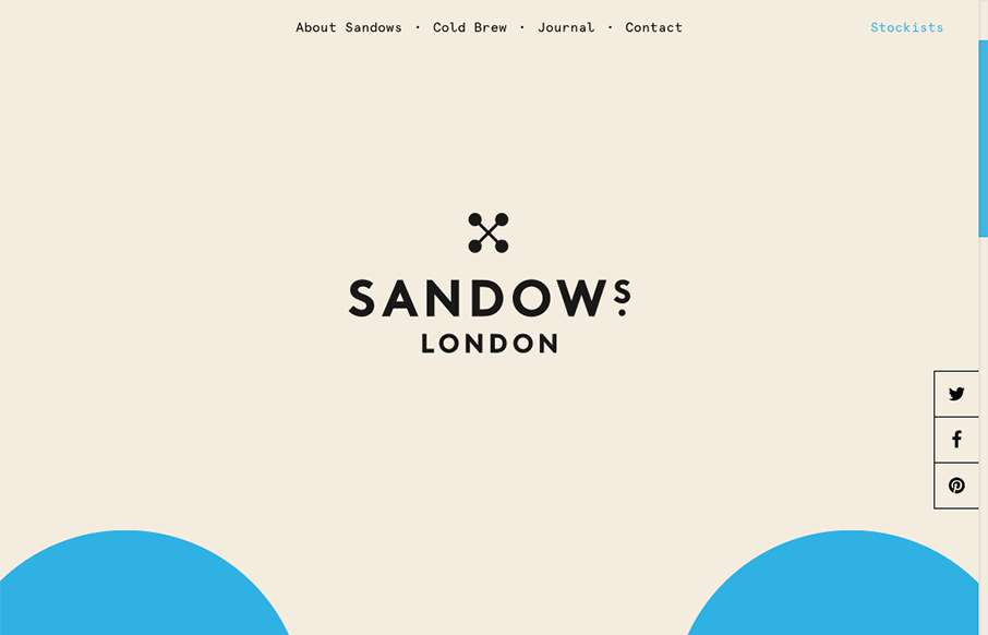
by Gene Crawford | Dec 3, 2015 | Food and Beverage, Gallery
Super cool scrolling image in the background of the site, turns out it’s the logo too. Pretty solid. I love the minimal yet engrossing vibe of the site. If only I could try this coldbrew!
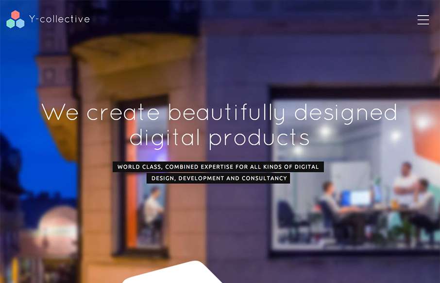
by Gene Crawford | Dec 2, 2015 | Gallery
Really cool layout and detail work for the Y Collective website. I love the honeycomb stuff and the load in animations on the different sections of the home page. Bravo on this design guys! From the Designer: When I have created logo, I decided that I will use the...
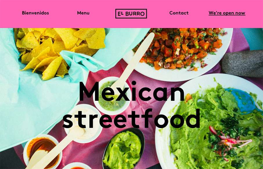
by Aaron Griswold | Dec 1, 2015 | Food and Beverage, Gallery
Tacos in Oslo.. yep. When I lived in Australia, getting Mexican food was always hit or miss – so hope El Burro’s food is as good as their website. BTW – this is a great one-pager for a restaurant (which we’ve said before… restaurant...