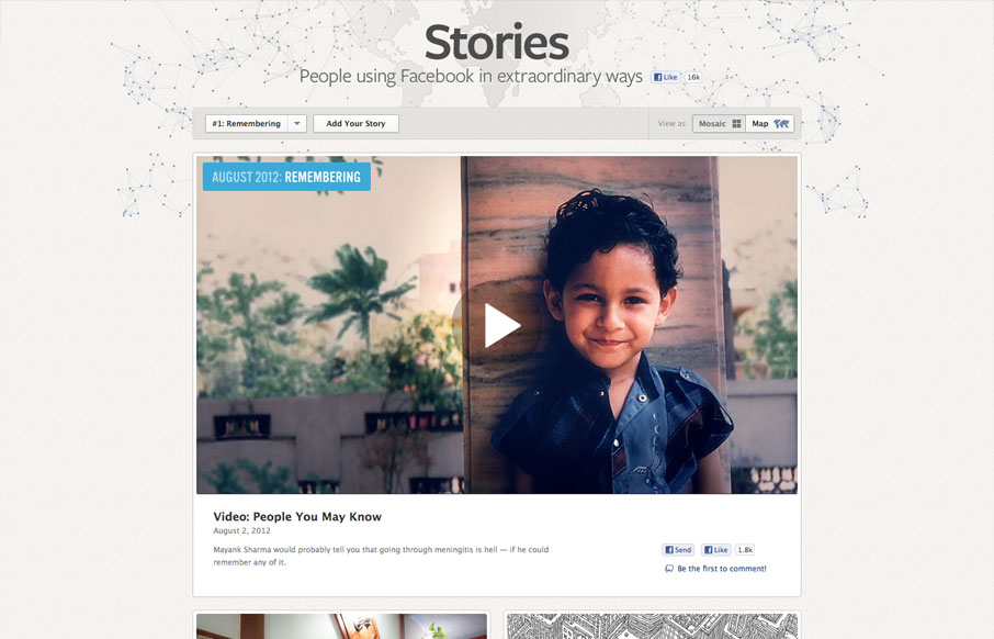
by Gene Crawford | Aug 7, 2012 | Gallery, Marketing
It’s cool to see such great design things coming out of Facebook. Is this what they’ve hired all those designers for? Could be, but I really like it! This design is rather minimal which is perfect for this scenario, the grid is also nice how it goes from...

by Giovanni DiFeterici | Aug 6, 2012 | Gallery
I really like the simple typography and strong asymmetrical composition of mangrove.com. The site has a minimal, but judicious application of color that leaves plenty of room for their content. Coupled with simple, yet sophisticated interactions, mangrove.com is the...
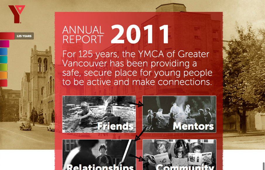
by Giovanni DiFeterici | Aug 2, 2012 | Community / Social Networking, Gallery
imagineourymca.ca is clearly designed to push the brand and to present a lot of information in a tight little package. I really like how the ‘pages’ have so much activity without getting in the way of the content. I especially enjoy the community sections...

by Giovanni DiFeterici | Aug 2, 2012 | Gallery, Travel
epicdeiscovery.com is a lovely little site with a whole lot of personality. It’s clearly designed to get a user to want to be out in nature and I think it succeeds beautifully. While structurally complex, the content is fairly minimal as are interactions. Each...
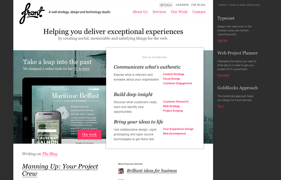
by Gene Crawford | Jul 31, 2012 | Gallery
I really like the way the layout of the homepage for designbyfront.com has been executed. The “badges” on the far right of the page are placed well and somehow don’t get missed like banner ads would. Then there’s the general layout of the...