by Gene Crawford | Sep 25, 2012 | Gallery, Gaming
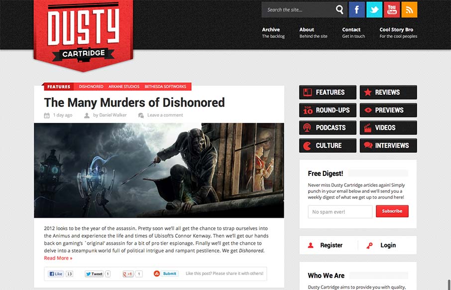
I like the blocky type design of this blog. It looks like it may be a theme but that doesn’t take away from it being a nice design. The logo is bold and the nav matches it in simplicity visually. Nice responsive layout too.

by Gene Crawford | Sep 24, 2012 | Entertainment, Gallery
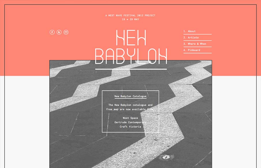
I like the way the lines used in this design and the big blocks of color or no color work together. Even into the type it feels unified yet unbalanced. Rich yet minimal that’s how i’d describe this design. Lovely.

by Gene Crawford | Sep 24, 2012 | Entertainment, Gallery
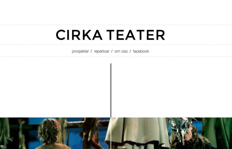
Cool vibe to this scroller website. I really dig how there’s a slight parallax thing going on with the show sections/images, it really helps give it some depth interaction wise. The flip over effect on the lightbox windows for the show details is unexpected yet...

by Gene Crawford | Sep 19, 2012 | Gallery
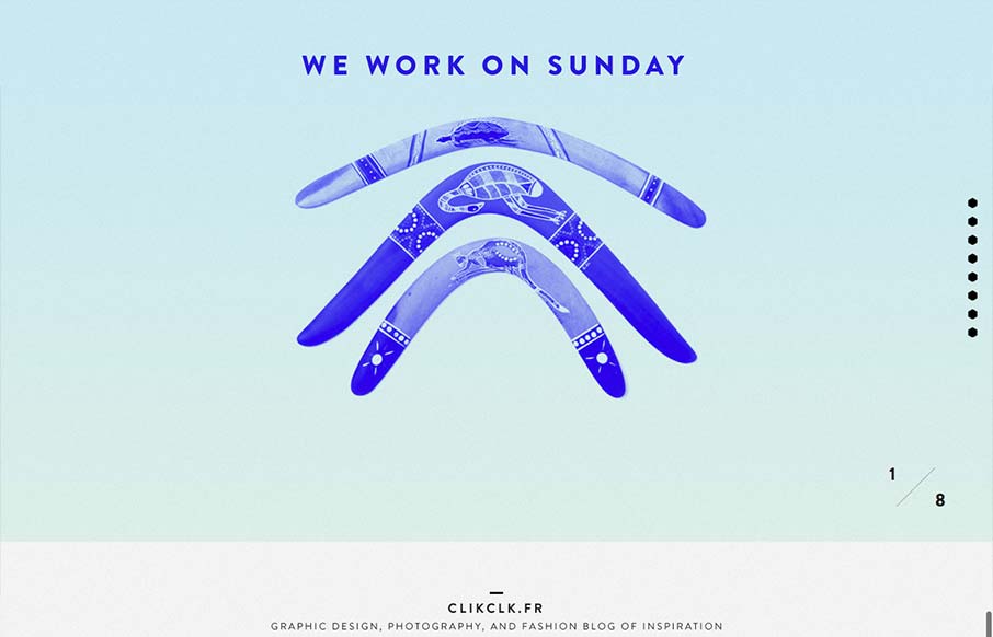
Fun website! I like the duotone color look as well as the way the scrolling is designed. Also cool way to display the work, in the monitors like that, it’s not new to see but in this instance it feels fresh somehow – maybe it’s the boomerangs?

by Gene Crawford | Sep 18, 2012 | Gallery, Marketing
Via: Bob Galmarini on Dribbble Really fun little microsite / landing page for the Pantech Flex went live today. Check out the screen swap to show off the different phone UI. What a great website design. It’s just a single pager or microsite as they’re...
