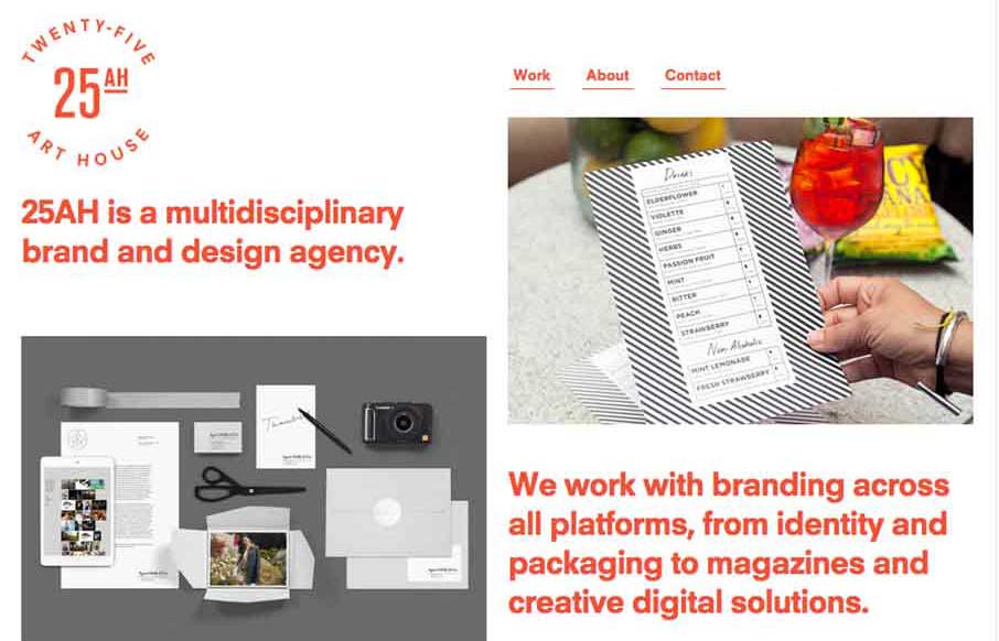
by Gene Crawford | Feb 24, 2015 | Design Firm, Gallery
The 25 Art House website has a really cool vibe with the clean and crisp typography and the large notecard looking case study link blocks. I dig the ‘masonry’ loading and sliding around the link blocks do as well on screen resize. Cool site.
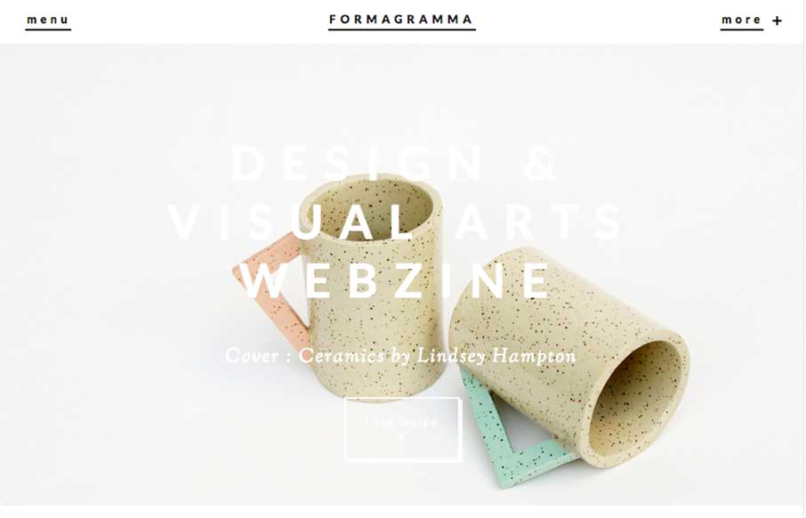
by Gene Crawford | Feb 23, 2015 | Gallery
Really interesting visual approach. It has the ‘feel’ of an art or design magazine for sure. I really like the ‘view article’ overlay for the sections as you make your way past the hero area. I also like the way they’ve handled the main...

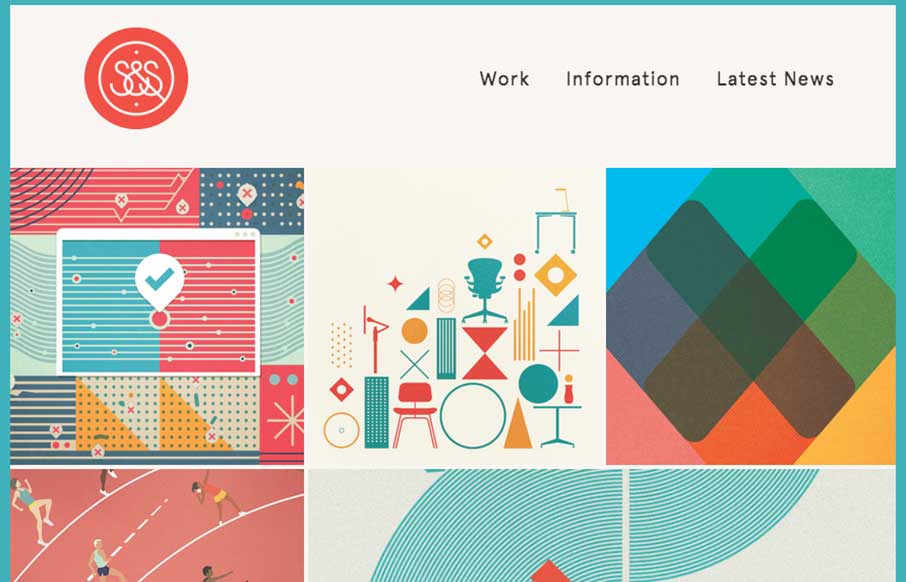
by Aaron Griswold | Jan 20, 2015 | Gallery, Shopping
Love the changes to the Five Simple Steps site from when we reviewed them last March. This feels right – it’s clean, simple, beautiful, and practical like the books they sell. It looks to be built on Shopify, but doesn’t have the feel of most...

by Aaron Griswold | Jan 15, 2015 | Entertainment, Gallery
“Love like you’ve never been hurt, sing like nobody’s listening and dance like you’re Tommy Franklin” This site from G’day Byron Bay design company is pretty stellar. I’ll let them explain the impetus for the site, but I love...
by Gene Crawford | Jan 7, 2015 | Gallery, Portfolio
Nice Masonry/Isotope type responsive effect here. Actually, digging into the code looks like it is Isotope… I like the usage of it here because it just feels a little different. Especially with the way the logo overlays on top of the images like that too as you...