by Aaron Griswold | Dec 11, 2014 | Gallery
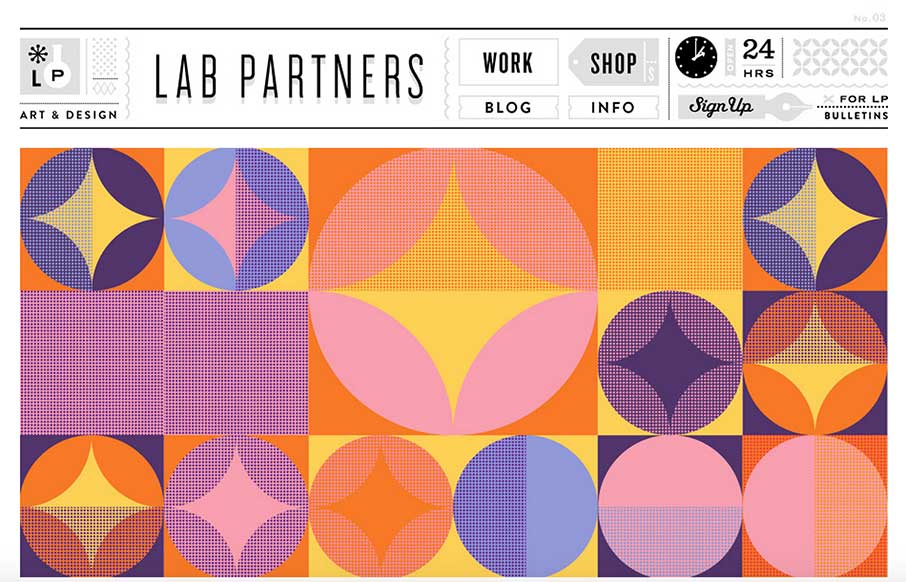
I love non-standard stuff, like with Lab Partners. For instance the clock in the upper right, works! I’m sure there’s a way to make this design responsive, but it’s still pretty sweet looking to me.
by Aaron Griswold | Dec 1, 2014 | Gallery, Shopping
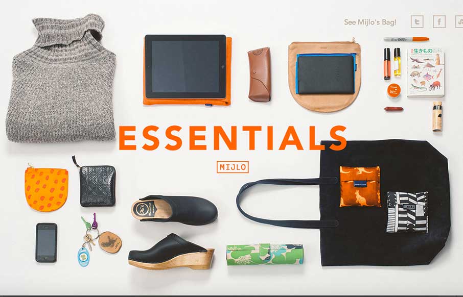
Something a little different – this is a splash site from Mijlo.com, based on their Kickstarter campaign for a sustainable backpack. MIJLO reached out to a select group of global creatives to curate a collection of essential items – with one caveat –...
by Aaron Griswold | Nov 25, 2014 | Design Firm, Entertainment, Gallery
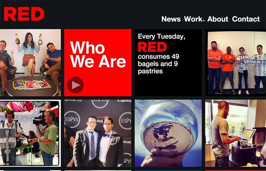
The way the site is built out of squares that adapt to the width of the browser screen (see what I did there?) is really neat. It’s simplicity but not overtly done. The nav reflects the simple approach to the layout too which is nice and clear.
by Gene Crawford | Nov 3, 2014 | Gallery, Travel
I really like the way the “departure” and “arrival” search is placed. It’s front and center, very good UI. I also dig the way the images reveal as you scroll down, normally I don’t like that kind of treatment too much but it works...
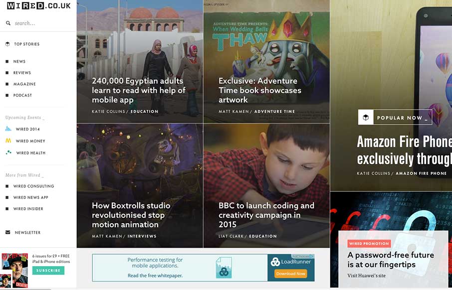
by Aaron Griswold | Sep 9, 2014 | Entertainment, Gallery
Man… usually infinite scroll on most sites isn’t so infinite… I still haven’t gotten to the end of Wired UK’s collection of cool photos and stories on this vertical infinite scroll… still going… nope… Obviously the...