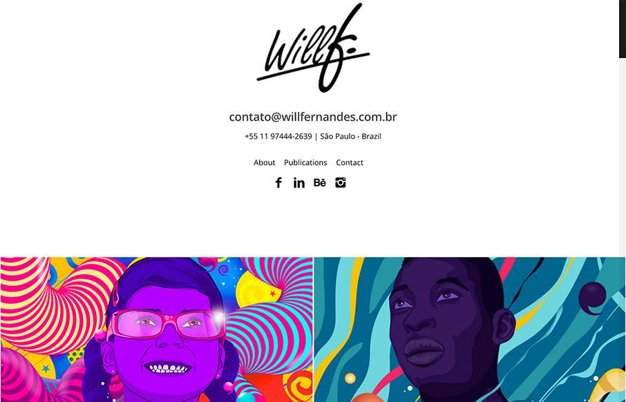
by Aaron Griswold | Oct 21, 2015 | Gallery, Portfolio
Love this site from Will Fernandes out of São Paulo, Brazil. I know that on the face of it, the site is mostly images – but everything is laid out cleanly to let the art be the center piece – great imagery! From the Designer: I am Will Fernandes, a...
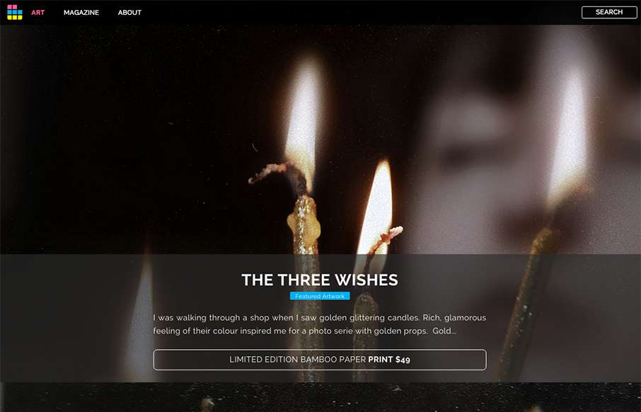
by Aaron Griswold | Oct 15, 2015 | Gallery, Photography
Looks like ArtSocket has changed it up a little since we reviewed them in January. They’ve continued to focus on the Art side, but making the experience a little more immersive with the full-width art scroll on the home page, and more detail on interior pages...
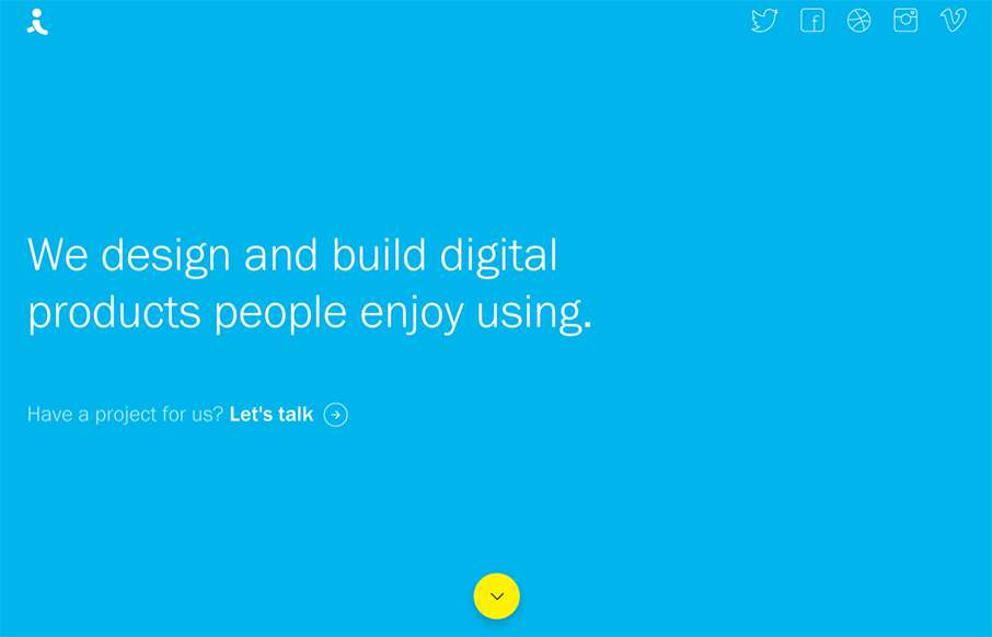
by Aaron Griswold | Oct 6, 2015 | Design Firm, Gallery
There are times when we see sites like the Indicius, and I think – way too busy, what’s going on… I don’t feel like that with this one – especially since there is no other navigation on the site. Really love the movement of the Case Study...
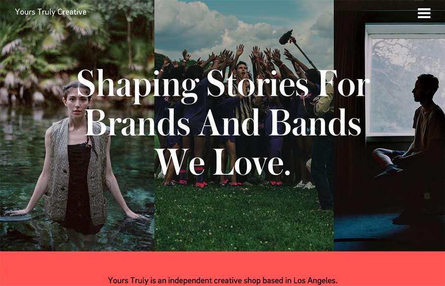
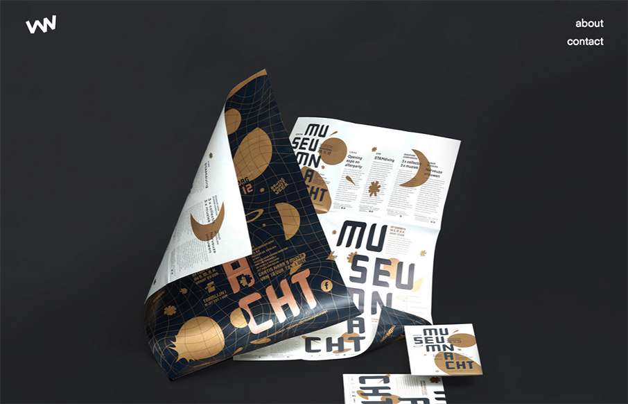
by Aaron Griswold | Oct 1, 2015 | Gallery
Really great editorial website layout. I love how the text flows between the images and the white space – and really love the rest of the text work on the other pages – it’s not totally bound to a grid.
by Gene Crawford | Oct 1, 2015 | Design Firm, Gallery
Really simple layout, it’s like one project at a time to check out then only 2 other simple nav items. I love this approach. I don’t like the bottom “read more” link, I’d like it to be more obvious across all images used for this section....