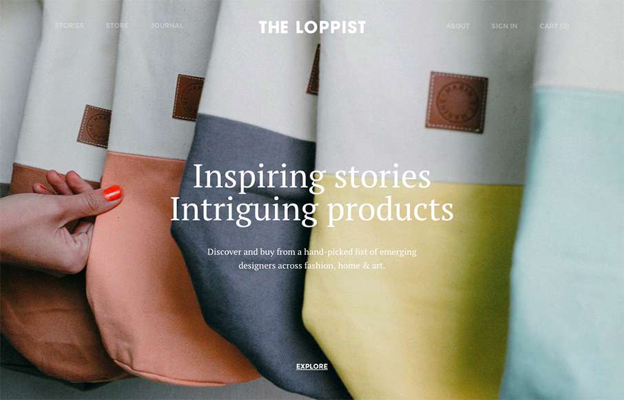
by Gene Crawford | Sep 30, 2015 | Gallery
The Loppist is a great example of a website with a “mega” drop-down navigation design. I really like this and how it shows more info before you drill down into the site. It’ll help that pogo-sticking thing that people get into on a product site.
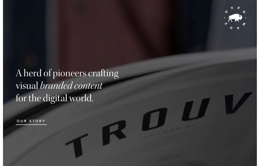
by Gene Crawford | Sep 24, 2015 | Gallery
Cool, image heavy site. I really like the hero image style video and then how the navigation comes up under that as you scroll and then sticks as the header. The remainder of the page is nicely organized and continues with the great imagery. From the Designer: Oxen is...

by Gene Crawford | Sep 21, 2015 | Gallery
I’m not sure how long this responsive version of Newsweek has been live but I really dig it. I like the balance between screen width targets, they’ve handled the in between very well too. The large images on the main stories are balanced well over the...
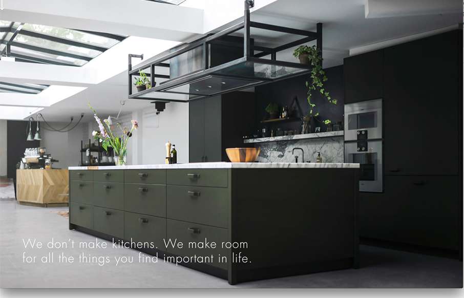
by Gene Crawford | Sep 3, 2015 | Gallery
Really cool way to start up a page of content. That large image that loads down to a smaller version and then the grid layout around it is pretty hot. Really digging this site right now.
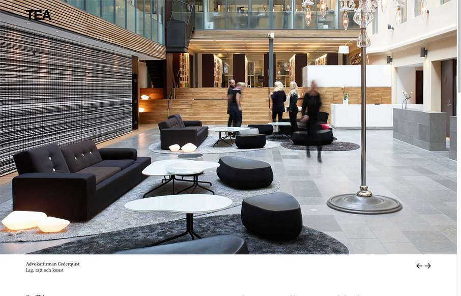
by Gene Crawford | Sep 3, 2015 | Gallery
Ahhh, that Swedish design. I love it so much. The crisp photography and the thin lines on the typography layered on top of a sharp grid. Wonderful stuff.