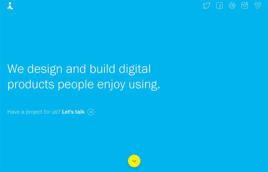
There are times when we see sites like the Indicius, and I think – way too busy, what’s going on… I don’t feel like that with this one – especially since there is no other navigation on the site. Really love the movement of the Case Study pages too.
Glassmorphism: The Transparent Design Trend That Refuses to Fade
Glassmorphism brings transparency, depth, and light back into modern UI. Learn how this “frosted glass” design trend enhances hierarchy, focus, and atmosphere, plus how to implement it in CSS responsibly.


Thanks for the positive feedback Aaron!