by Gene Crawford | Nov 12, 2015 | Gallery, Marketing Company
I love the “vibe” of this website. The way the main section changes across screens is smart and subtle. I also love the way they used the fixed background image as you scroll to keep a nice rhythm going for you. The play between muted and strong colors...
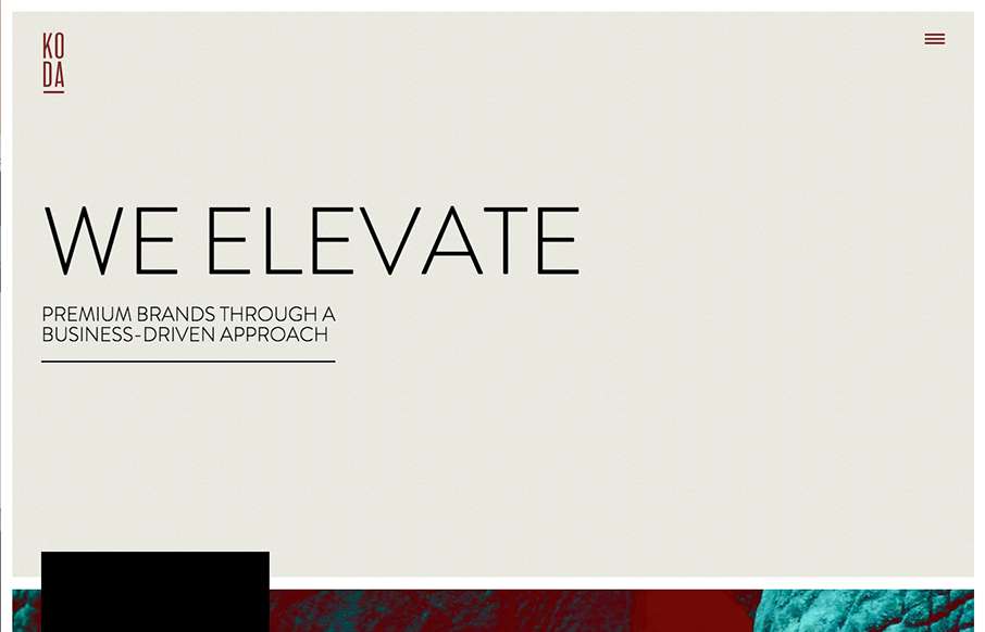
by Gene Crawford | Nov 11, 2015 | Gallery
I really like this website design. It’s very straightforward and we’ve all seen similar layouts, but they’ve managed to just execute it really cleanly and visually strong. I like the details and the solid approach. Things like spacing and timing are...
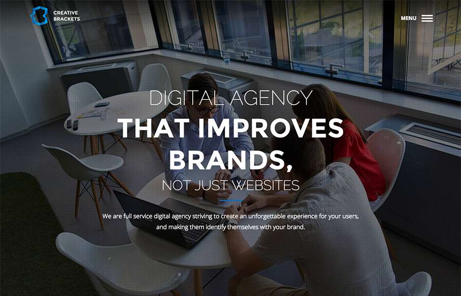
by Gene Crawford | Nov 10, 2015 | Gallery
Some real neat visual/interaction stuff going on here. It’s cool and works well and I think users who are not web designers will kind of dig it. The rest of the website from content to execution is top-notch as well. Good stuff and worthy of checking out. From...
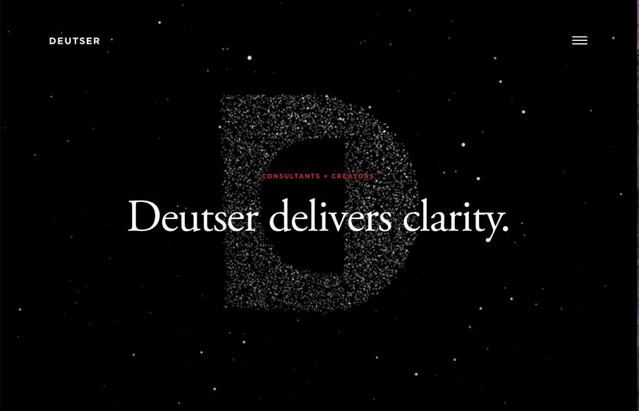
by Gene Crawford | Nov 9, 2015 | Entertainment, Gallery
Beautiful website overall. The single reason i’m reviewing it for the site here is the way they’ve made the main page “slider” most of the home page content as they have. It’s smart and I thoroughly enjoy this idea.
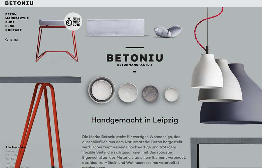
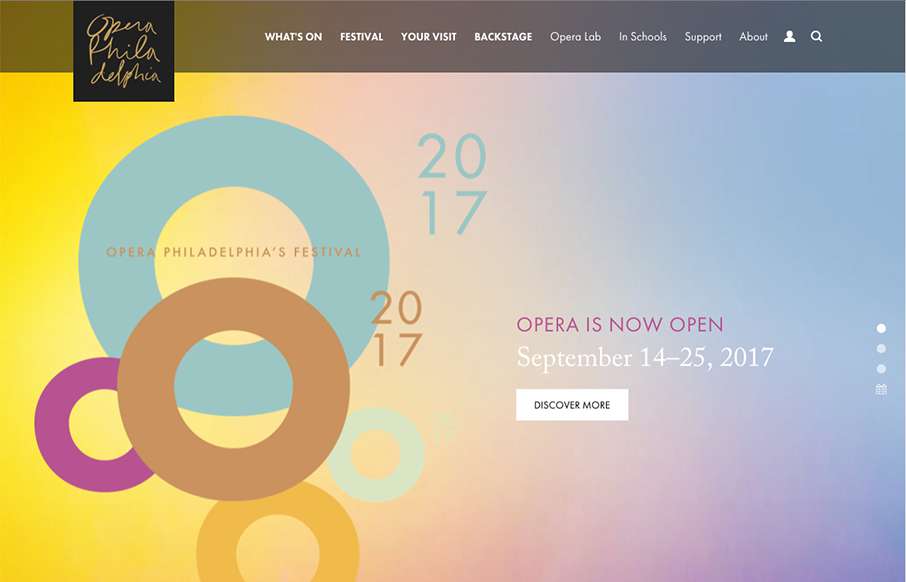
by Gene Crawford | Nov 9, 2015 | Gallery, Product
Really cool asymmetrical approach to this design. Largely the images of the products lend to making this page feel vibrant and unique. This same vibe carries through to the sub pages too. Really good looking stuff. Submitted by: Marcus Blättermann Twitter:...