
by Giovanni DiFeterici | Sep 13, 2012 | Gallery
This is how you should post job openings. This is a lovely little site to entice people of the ‘web nerd’ persuasion. I think that the photo animation is a bit much and seems a little out of place in an otherwise tight and professional design, but...
by Gene Crawford | Sep 12, 2012 | Gallery
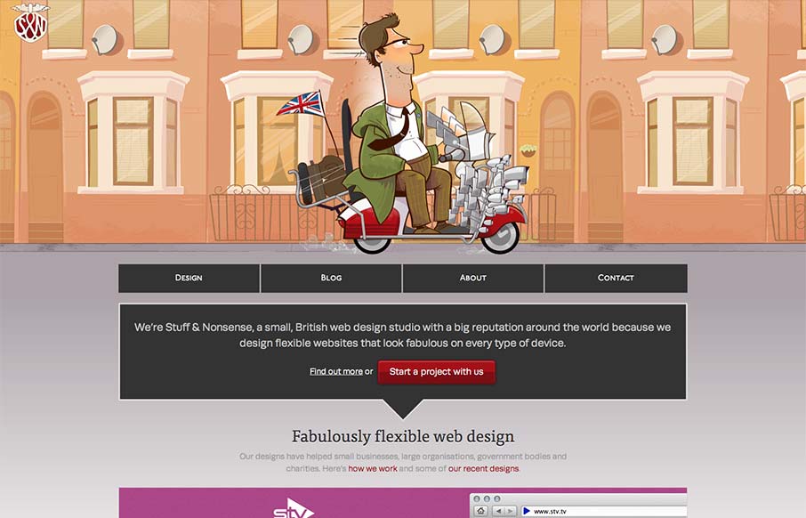
Super fun reboot from Andy Clarke’s stuffandnonsense.co.uk website. Outside of the technical stuff, which yes you should go view source and pour over it. The header is so fun, the illustrations of the dude on the bike with the animated background makes it so...
by Giovanni DiFeterici | Sep 11, 2012 | Food and Beverage, Gallery, Screencast Review
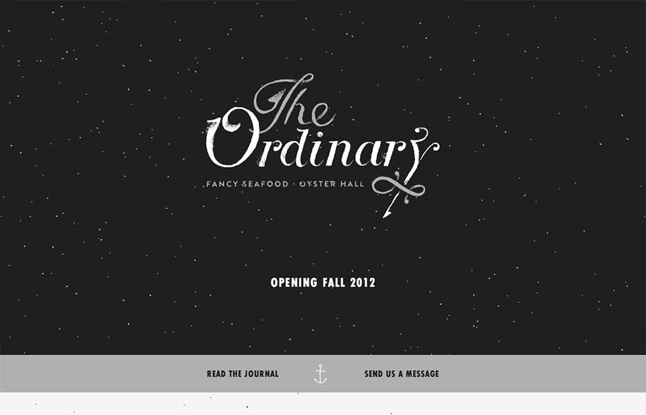
I have to say that I think this is an great site. It has just the right mix of texture, art and typography. My favorite part of the design is the speckled background, which does a great job of softening and activating the negative spaces without making the design...

by Gene Crawford | Sep 11, 2012 | Gallery
This slider is so coolconvax.com— Dan Denney (@dandenney) September 4, 2012 Agreed Dan, the animation that follows your mouse around behind the slideshow is clever. It’s something that’s pretty minimal really, as fare as interaction goes, but works...
by Gene Crawford | Sep 10, 2012 | Gallery
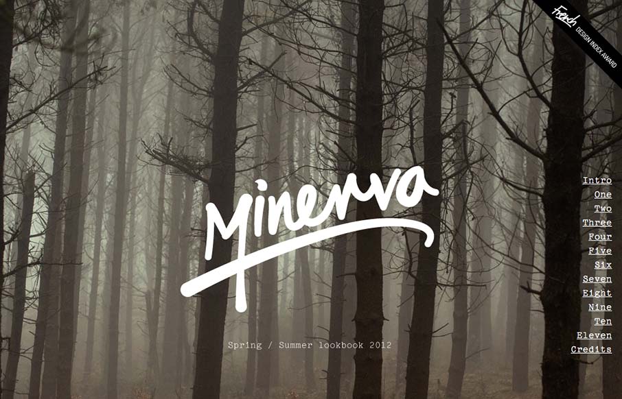
Great looking single page scroller. I love the long almost narrative feel to the catalog here, the product displays are well done too. I think the fixed nav element is a little bit understated but it’s a subtle design and I totally understand it in the end.
