by Gene Crawford | Aug 13, 2012 | Gallery
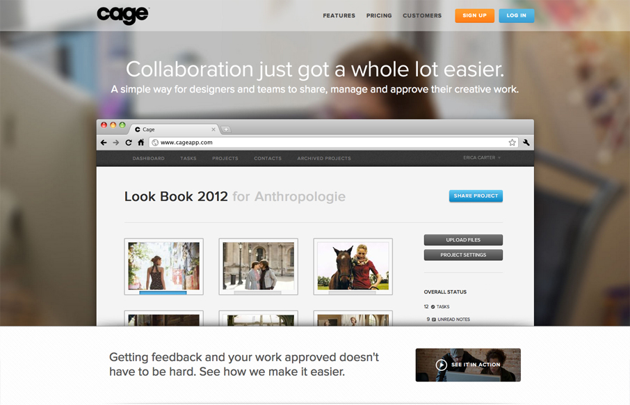
Name: Sandip Patel @cageapp Role: Designer & Developer Cage is an online collaboration tool that provides a secure environment for creative teams in web, mobile, print, video, design, 3D and motion graphics to easily present their work for feedback and approval....
by Gene Crawford | Aug 8, 2012 | Design Firm, Gallery
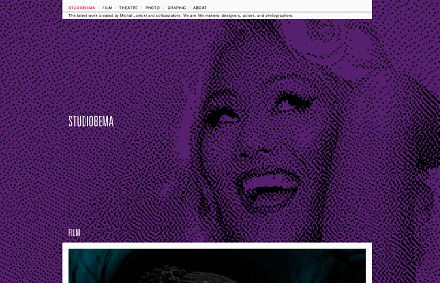
Relatively simple website when you get down to it, the interactions aren’t mindblowing but what’s really nice is the simplicity mixed with the large illustrated background image/photos. For some reason they’re just engaging to me and I love...
by Gene Crawford | Aug 7, 2012 | Gallery, Marketing
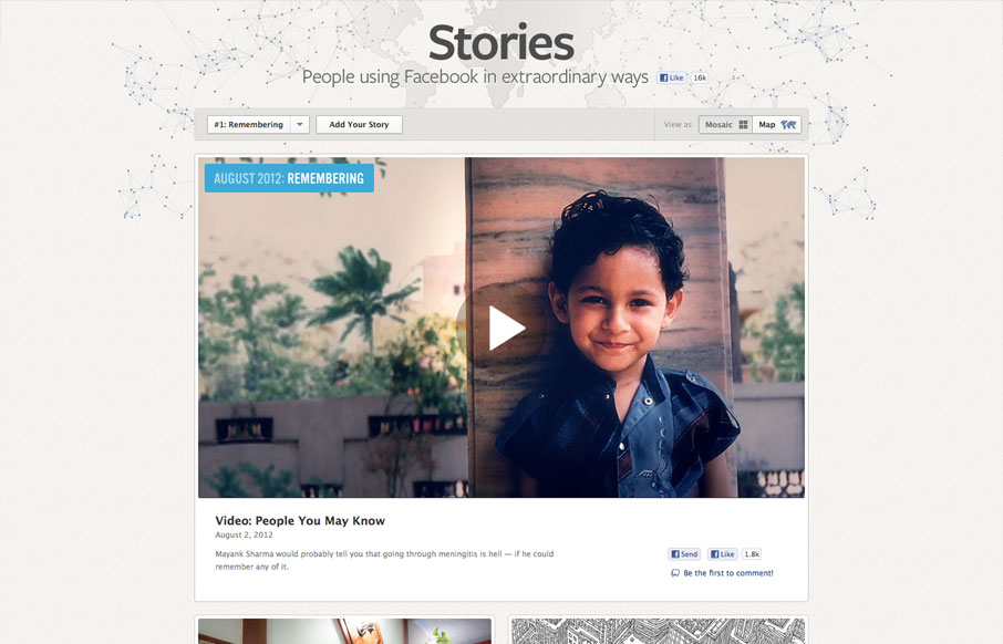
It’s cool to see such great design things coming out of Facebook. Is this what they’ve hired all those designers for? Could be, but I really like it! This design is rather minimal which is perfect for this scenario, the grid is also nice how it goes from...
by Gene Crawford | Aug 6, 2012 | Gallery
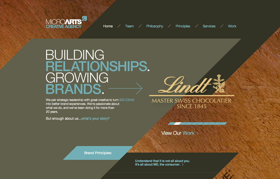
The diagonals really make this website dynamic visually. The flat shapes of color laid on top of the textured background image also adds to the visual interest to keep you looking. I find the colors a bit muted personally but it still works tone wise when you read the...
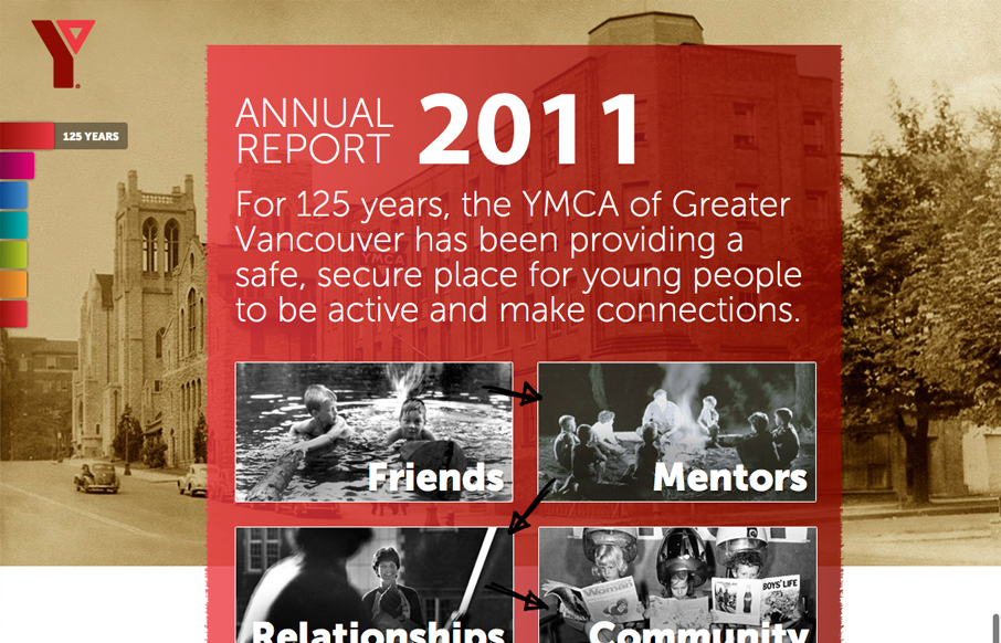
by Giovanni DiFeterici | Aug 2, 2012 | Community / Social Networking, Gallery
imagineourymca.ca is clearly designed to push the brand and to present a lot of information in a tight little package. I really like how the ‘pages’ have so much activity without getting in the way of the content. I especially enjoy the community sections...