by Gene Crawford | Dec 11, 2012 | Gallery, Music
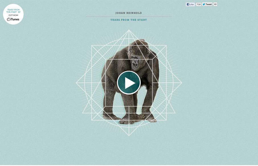
Submitted by: Johan Reinhold Role: Designer & Developer Official website of Swedish electro-pop outfit, Johan Reinhold. I like the interaction animations worked into this site. Like the gorilla and the beating heart illustration. I think the way it’s...

by Gene Crawford | Dec 10, 2012 | Food and Beverage, Gallery
Pretty nifty interactions and page load animation. Keeps the site very memorable visually.
by Gene Crawford | Dec 10, 2012 | Gallery
The distinct navigation layout change going from the desktop to smaller screen widths is a very nice difference from most other responsive sites’s i’ve been seeing. There’s also a lot of interaction built in as you mouse over and click on the various...

by Gene Crawford | Dec 6, 2012 | Gallery
What a richly packed layout we have here. It’s simple and open yet very dense visually at the same time. That’s very hard to achieve and Mobilla does it very well. I especially like the main hero image that’s responsive and static almost with the...

by Gene Crawford | Dec 5, 2012 | Gallery
Nicely done coming soon page, it’s almost a full site really. The single page actually does it justice since it’s so concise. I like the way the email signup stays readily visible as you scroll down – almost becoming more so because of the...