
by Gene Crawford | Dec 4, 2012 | Gallery
I like the left to right changing layout. Very asymmetrical and open vibe. I also dig the mobile nav design, feels really app like. Clever stuff.
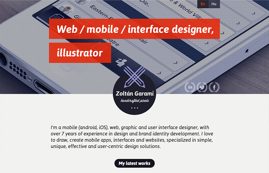
by Gene Crawford | Dec 4, 2012 | Gallery, Portfolio
Submitted by: Zoltan Garami @garamiz Role: Designer I like the placement of the red behind the white text that’s over the monochromatic image. I know it’s simple and been done before but it’s nicely done here and I just like it. The logo is nicely...
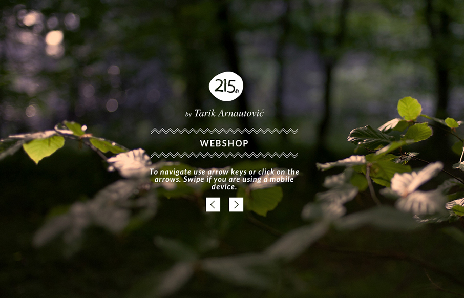
by Gene Crawford | Dec 3, 2012 | Gallery, Portfolio
I love subtle design and this site is a perfect example of that. The left right arrows that match up with the keypad, then the simple placement of interactions/controls. Like when you click on menu and the big X is over the content of the previous page/view. Love it....
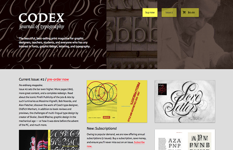
by Gene Crawford | Nov 29, 2012 | Gallery
The Codex Magazine website is beautiful. I love the blocks of content on the home page, it’s clear and concisely laid out and all so well balanced. It feels a little asymmetrical but completely balanced evenly. It’s also a really nice mobile layout down to...
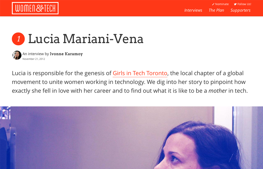
by Gene Crawford | Nov 29, 2012 | Community / Social Networking, Gallery
Brilliant layout for the Women & Tech website. It’s a gorgeous long form narrative based content site with a responsive wrapper. I love it. It’s also a really great service for the community at large.