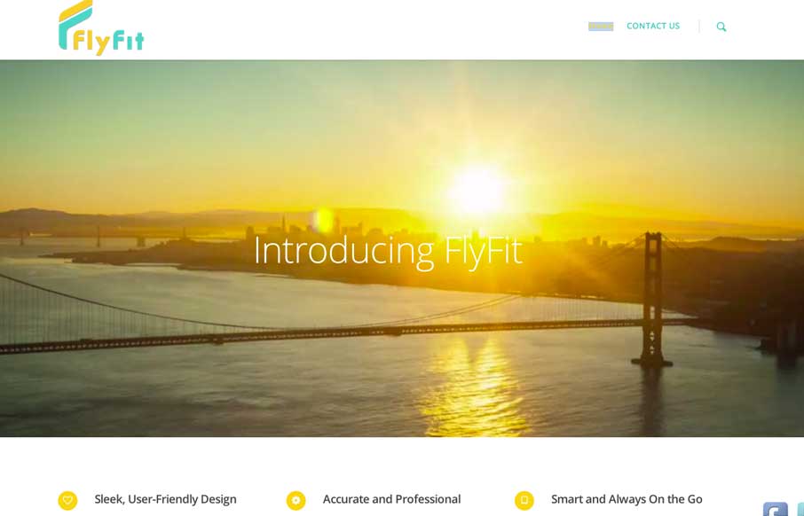
by Aaron Griswold | Mar 5, 2014 | Gallery, Marketing
This is a fast loading video based site that was made for a large screen. It has subtle parallax elements that don’t detract from the main video feature of the site. They could probably go with a cleaner social media linking system, but since it’s a new...
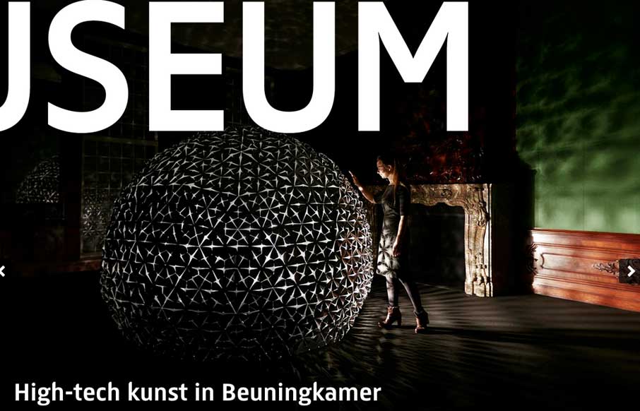
by Gene Crawford | Mar 4, 2014 | Education, Gallery
There is some really neat design stuff going on with this site. I love how the “Rijks Museum” overlays and play with the slider. Then the top nav is just fun to mess with. Nice responsive work here too.
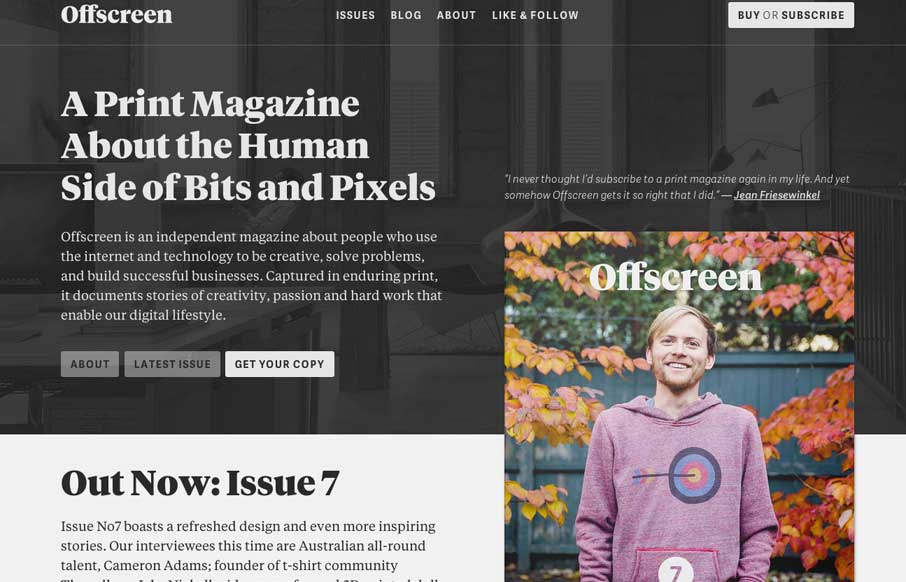
by Giovanni DiFeterici | Mar 4, 2014 | Gallery
Offscreenmag.com looks great at all screen sizes. I really enjoy the balance of the typography and soft grays. The site does a great job of balancing a lot of information with a minimal design language. Simple and elegant. We get the mag and that’s nifty too....
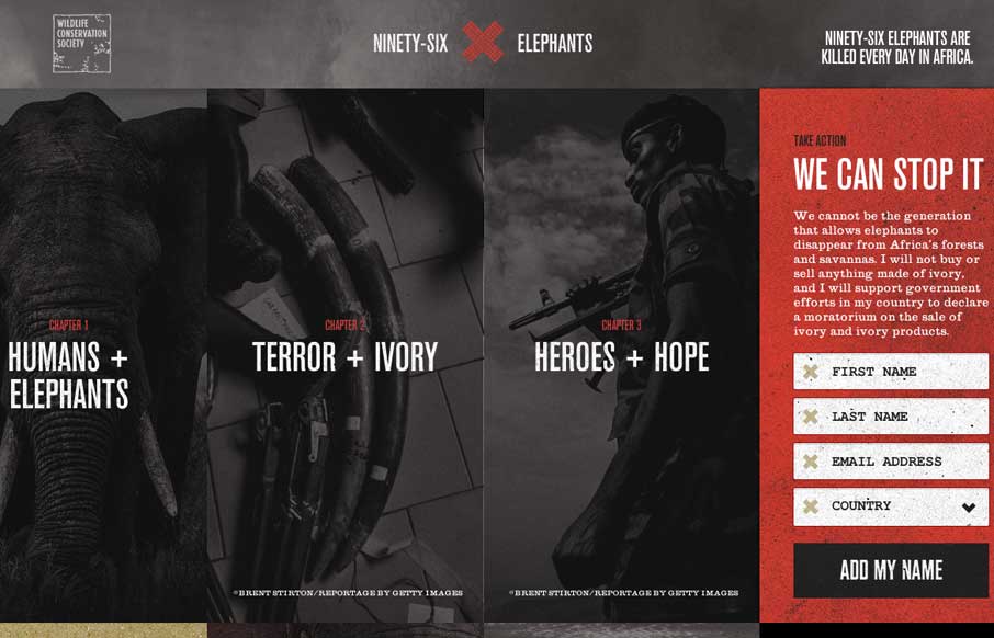
by Gene Crawford | Feb 28, 2014 | Gallery
Beautiful website for a good cause. I really like how the petition slide-out menu works, kind of following you down the page as you scroll end bouncing out when you click. Beautiful photography too. Sign it and maybe save an elephant man!
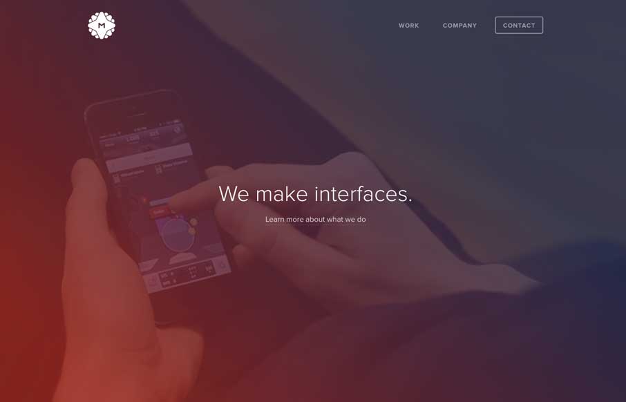
by Gene Crawford | Feb 27, 2014 | Gallery
I really like the overall simplicity in this design. It get’s you to the point really really fast. I think it boarders on being too subtle at times, but that’s not always a bad thing 🙂 I love the visual rhythm in the work page the most. They could keep...