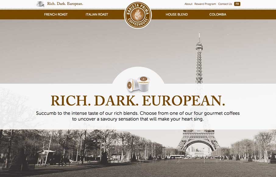
So… as soon as I saw this site, I fired up the Keurig. The black, white, gray and coffee brown immediately put me in a mood to enjoy coffee.
The entire site is centered around the brand’s tagline: “Rich. Dark. European.” The background images, the parallax effects, and the coloring all come together for a rich, dark, (and European?) experience.
So in a design and strategic sense, I think the Barista Prima is doing exactly what they intended – I’m drinking coffee right now (and maybe I’ll look into buying a couple of K-Cup Packs after this review…).


0 Comments