
by Maria | Feb 27, 2014 | Gallery
You see these nice responsive sites with their sticky nav and circular images and slick transitions and think, “Yeah, that’s cool, they did everything right.” I’ll be honest, you don’t typically see this much content loaded in and still...

by Gene Crawford | Feb 26, 2014 | Gallery
Neat app site design. I really like how the top navigation comes from the bottom(ish) of the space you see after the initial home page area loads. Sliding up to take it’s place at the top of the page. Then the slight parallax behind each screenshot, then how you...
by Giovanni DiFeterici | Feb 26, 2014 | Gallery
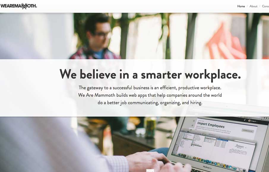
The We Are Mammoth website is a simple site that feels tight and focused in content, clear in message and definitive in style. Not much more to say. Good stuff.
by Giovanni DiFeterici | Feb 25, 2014 | Gallery
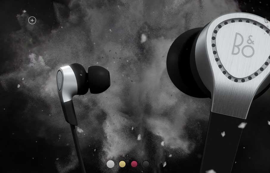
Beoplay’s H3 site site is truly beautiful. I’m often against the practice of hijacking the user’s ability to scroll, but the effect works really well on this site. Every ‘page’ is clean and minimal, but provides a very different user...

by Gene Crawford | Feb 20, 2014 | Gallery
New site for NineLabs. One of the strongest factors working on this site are all the testimonials. It really feels like this team is on the ball and really delivers quality to get so many great referrals to put on the page like this. The visual aspects of the design...