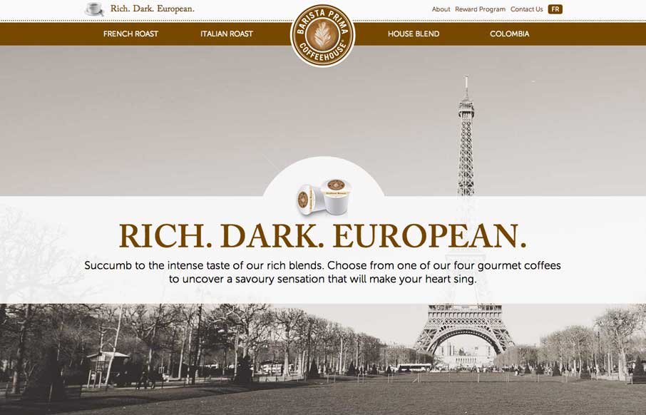
by Aaron Griswold | Mar 11, 2014 | Food and Beverage, Gallery
So… as soon as I saw this site, I fired up the Keurig. The black, white, gray and coffee brown immediately put me in a mood to enjoy coffee. The entire site is centered around the brand’s tagline: “Rich. Dark. European.” The background images,...
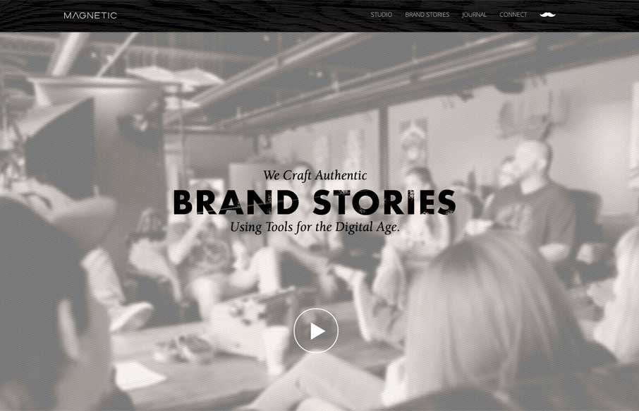
by Gene Crawford | Mar 10, 2014 | Design Firm, Gallery
Really cool looking mix of tight straight edges and hand made type treatments, mixed with the sepia colored imagery. This site has a nice hand made feel but also very high end. The slight movement of the images behind the type overlays add that extra little dimension...
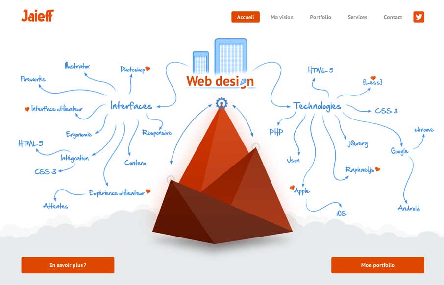
by Gene Crawford | Mar 7, 2014 | Gallery
There’s a lot to like about this website. But the best part is the interactive illustration on the home page. It’s pretty fun to mouse over that little gear and get all the arrows and stuff to show up. Also check it out on smaller screen widths, the stuff...
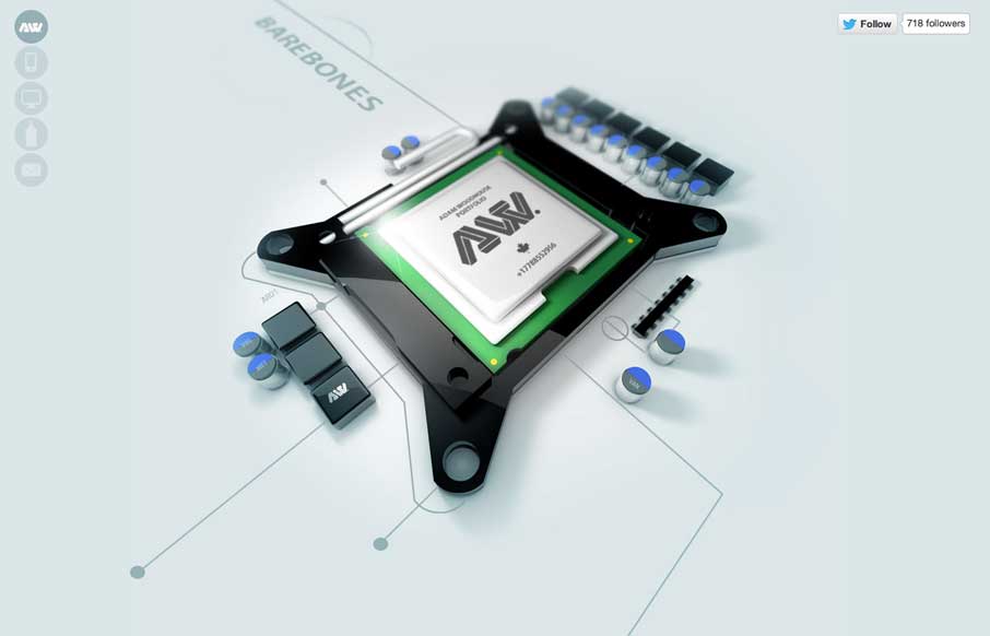
by Giovanni DiFeterici | Mar 6, 2014 | Gallery, Portfolio
The Adam Woodhouse website is clearly a design intended to impress with lush, complex animations and a strong graphical sensibility. Not responsive, but beautiful nonetheless. Plus, Bender.
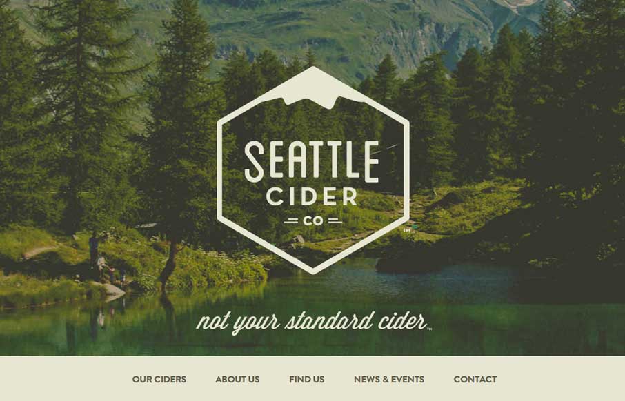
by Giovanni DiFeterici | Mar 5, 2014 | Food and Beverage, Gallery
The Seattle Cider Company website uses flat illustrations and simple interactions to control the narrative of the cider making process. The design style is hip and minimal with a few nifty tricks (like the slide-in fixed nav) and a lot of character. The narrative...