
by Gene Crawford | Mar 14, 2014 | Gallery
The Five Simple Steps isn’t one of those sites that has tons of interactions and moving elements. But the design is simple and effective. I really like how the main hero image/area isn’t just a big JPG, that’d be lazy, they add the extra effort and...
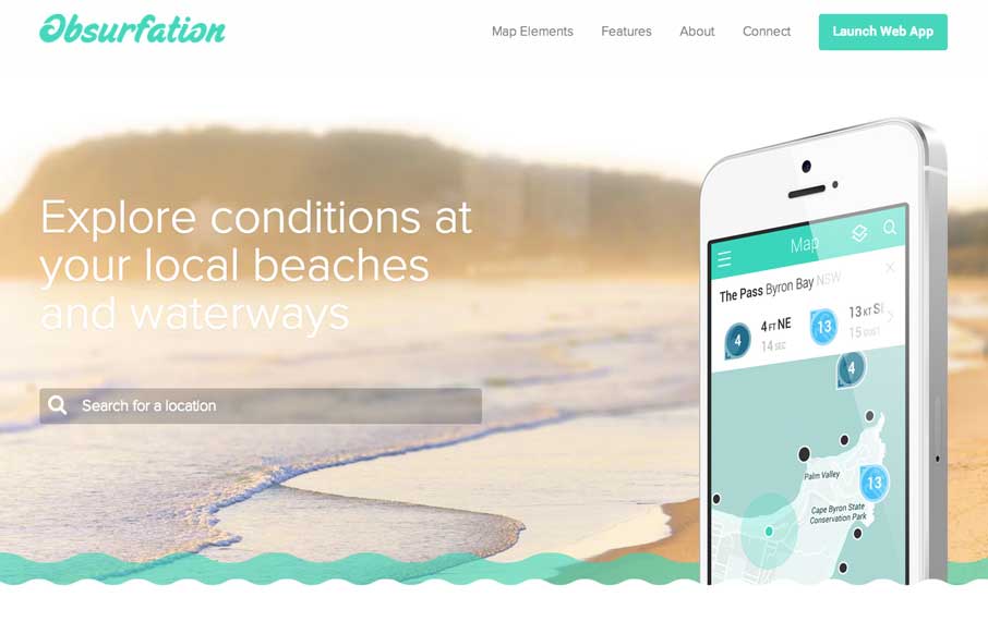
by Gene Crawford | Mar 13, 2014 | Gallery
I’m not a surfer, nor live near an ocean, but if I did i’d use this app just because of the website. I love the slight animation of the waves and the little mouse interactions here and there.

by Gene Crawford | Mar 12, 2014 | Gallery
Nice slick feel to the design. I like the soft almost washed out colors, almost black and white feel to the design. Things move well and the rhythm is good as you make your way down the page. I also really dig the plan a project form.
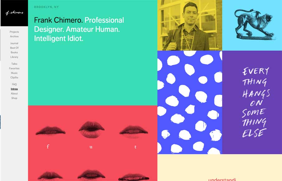
by Gene Crawford | Mar 12, 2014 | Gallery, Portfolio
The latest version of Frank Chimero’s personal website is just great. I love that it’s largely traditional in that the nav is just there on the left, in text form, for anyone to see and click. It’s this kind of understated beauty that reminds me why...
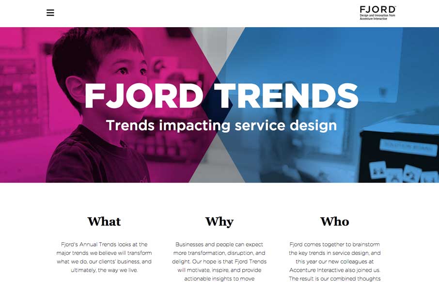
by Gene Crawford | Mar 11, 2014 | Gallery
What a great reading experience the Fjord Trends site turns out to be. Both on the desktop and your mobile device. I love how the stories flow with nice bold blocks of imagery then “fold” out so you can read them right there. The tracking nav on the right...