
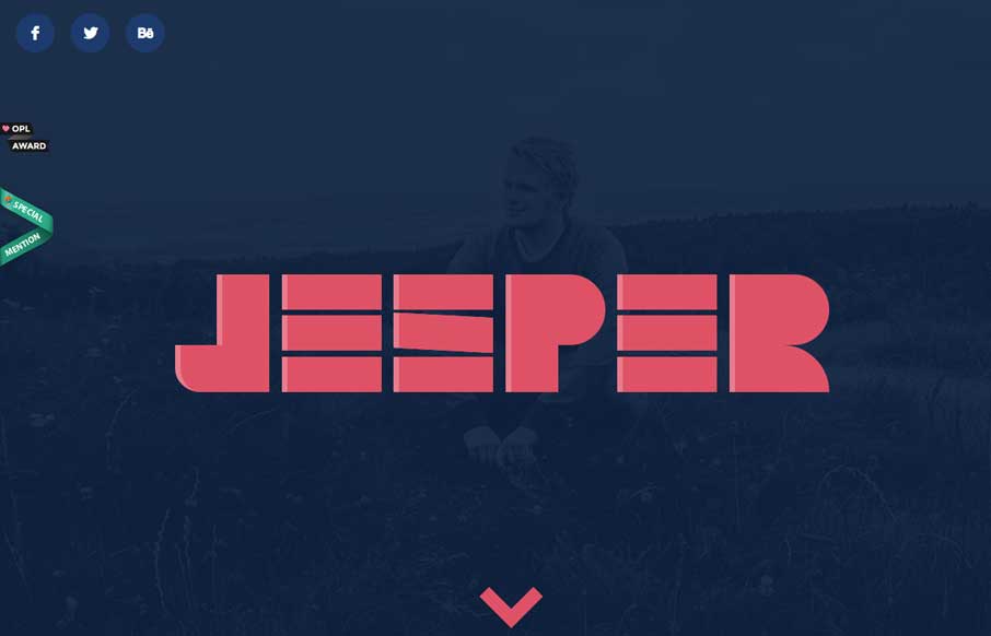
by Gene Crawford | Mar 25, 2014 | Entertainment, Gallery
Like with the vimeo player page this shows off a type of view of YouTube videos. The page is a great way to show off all the features and get you through them fast. It’s a long single page with fixed spots you can glide to from the top nav – pretty...
by Gene Crawford | Mar 24, 2014 | Gallery, Portfolio
I love this portfolio site design. It has all the stuff you expect from a designer site and done pretty well. I like the skills graphs and the little interactions. The stark bold design esthetic is quite nice as well. Lovely.
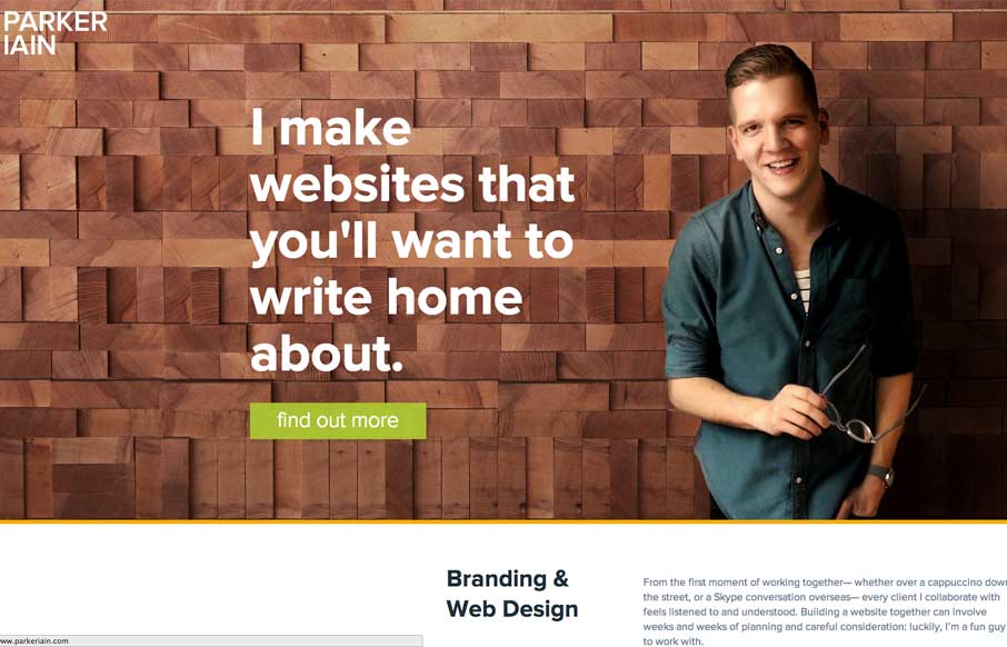
by Giovanni DiFeterici | Mar 20, 2014 | Gallery
Parkeriain.com is a portfolio site with a simple, but well conceived structure. I like how the footer has been strategically used to create a call to action on every page. It’s a small detail, but effective when flipping through the portfolio detail pages. Solid...
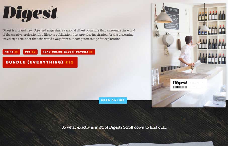
by Giovanni DiFeterici | Mar 19, 2014 | Gallery
The Digest is a beautifully editorial site that displays a tight print design sensibility. It’s a site that takes the idea of a magazine and translates the best of that medium to the web. The pages are fairly heavy at 4-5 MB, but the lush photography is largely...
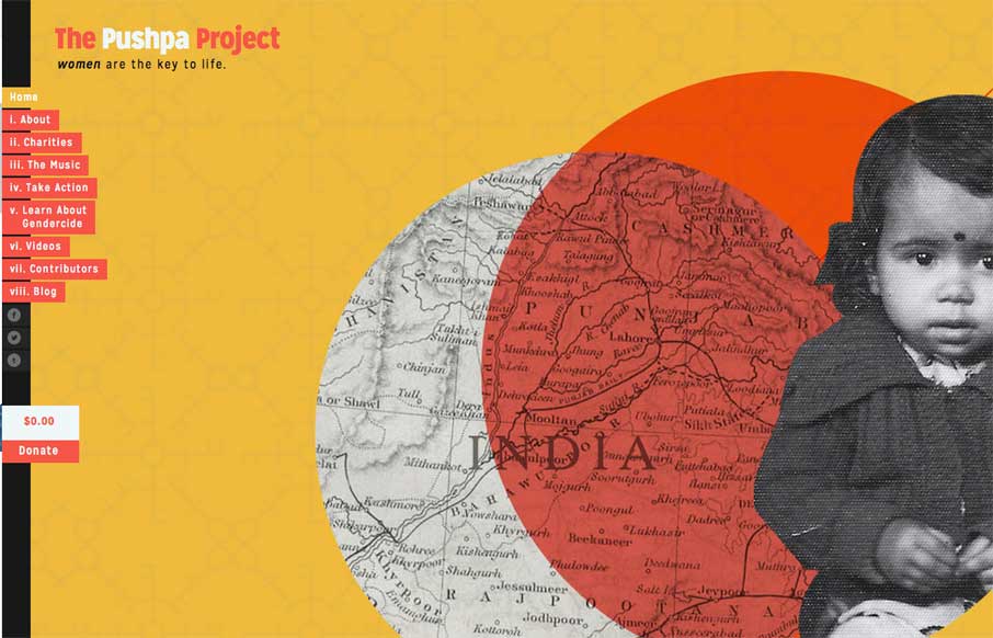
by Giovanni DiFeterici | Mar 19, 2014 | Gallery
The Pushpa Project is a narrative site that seems to draw strongly from print design. The minimal color does a great job of focusing the reader’s attention on the text. I really enjoy the site’s primary navigation, which does a great job of reenforcing the...