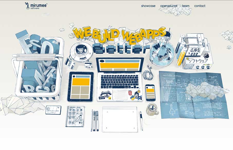
by Aaron Griswold | Mar 31, 2015 | Gallery
Now this is a fun agency site from Mirumee Software out of Poland. Cool illustrations, some subtle parallax animation, and good coloring makes this one pager vibrant and inviting.
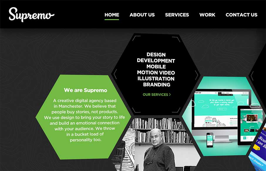
by Aaron Griswold | Mar 30, 2015 | Gallery
Good start to the week with Supremo’s site, out of England. The home page is a different take on interactive navigation, which sets it apart from other agency sites. The Work (portfolio / case studies) area is strong and well thought out. Cheers! From the...

by Aaron Griswold | Mar 26, 2015 | Gallery, Portfolio
Cool, quick portfolio one pager from Mukesh Suthar out of India. Of course love the Rubik’s Cube preloader – good movement through the rest of the site between the sliders and skill counters. Like the way he has the faceted search on the Work section too...

by Aaron Griswold | Mar 25, 2015 | Gallery, Marketing Company
I like how Acara Partners, out of Connecticut, uses their home page image background to be a secondary navigation – cutting straight to what they do. The site is text heavy and icon rich – and that works more for a biz strat / marketing company (their two...

by Aaron Griswold | Mar 25, 2015 | Gallery
I’m glad Lounge Lizard out of NY and LA submitted their website to us. There’s a little bit of Don Draper in all of us (hopefully the good parts) – and that’s projected in LL’s website, along with good modern design. Like the block design...