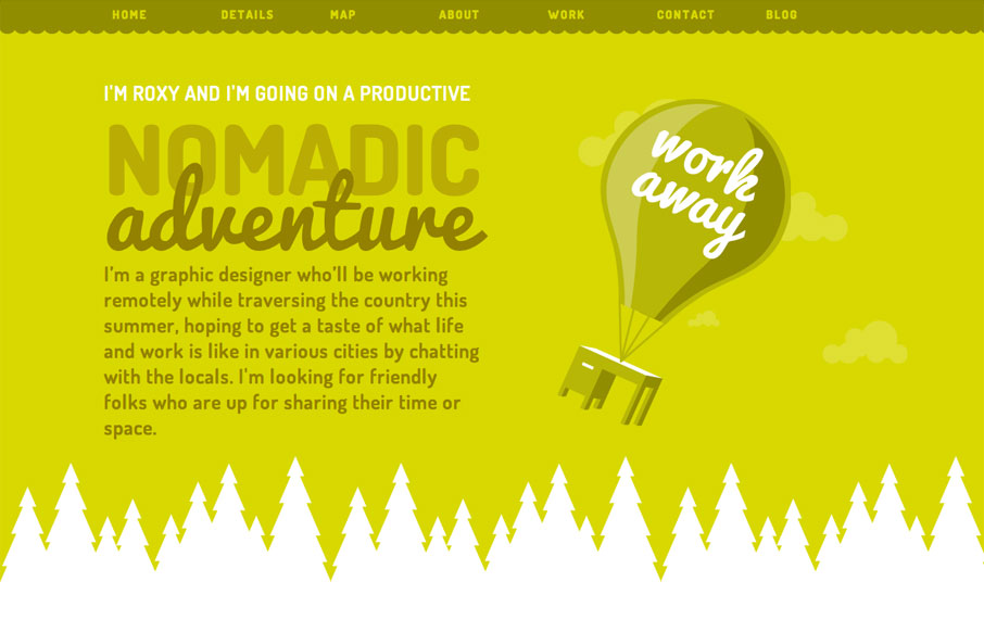
by Gene Crawford | Aug 10, 2012 | Gallery, Travel
Just a great consistent feel across all elements of this single page website. The illustrations and colors have a really nice feel and it comes off as very welcoming. I like that it is responsive, specifically how the images resize and the choices made there between...
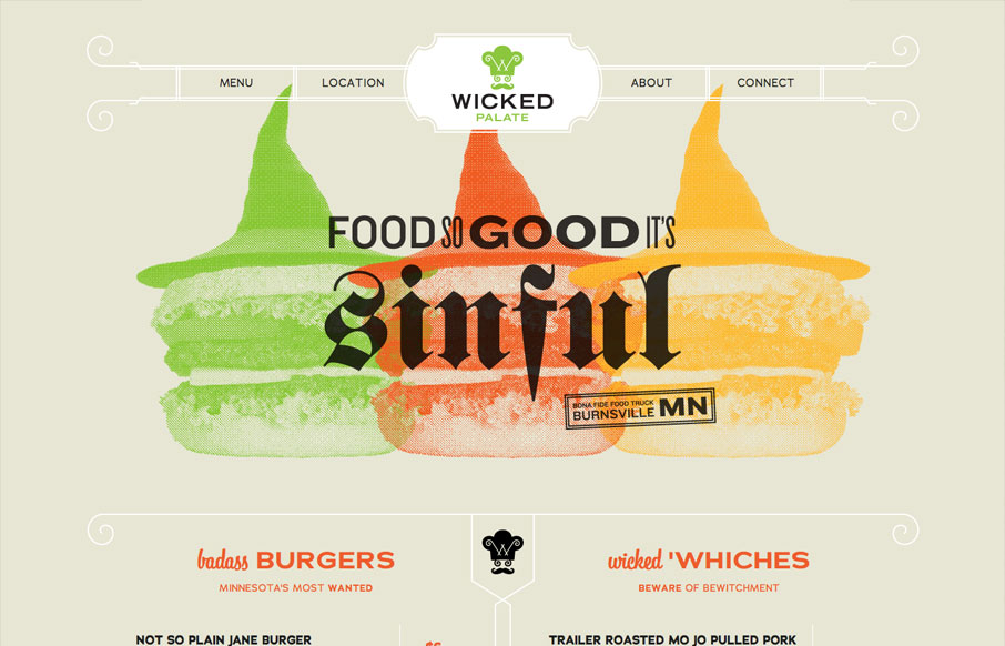
by Gene Crawford | Aug 8, 2012 | Food and Beverage, Gallery
Holy cow, this is how all restaurants should do their websites. It’s a single page that uses anchors to scroll you down to the section you need. It’s mainly a menu. Then it’s responsive so you can see it on your iPhone, which I don’t know about...
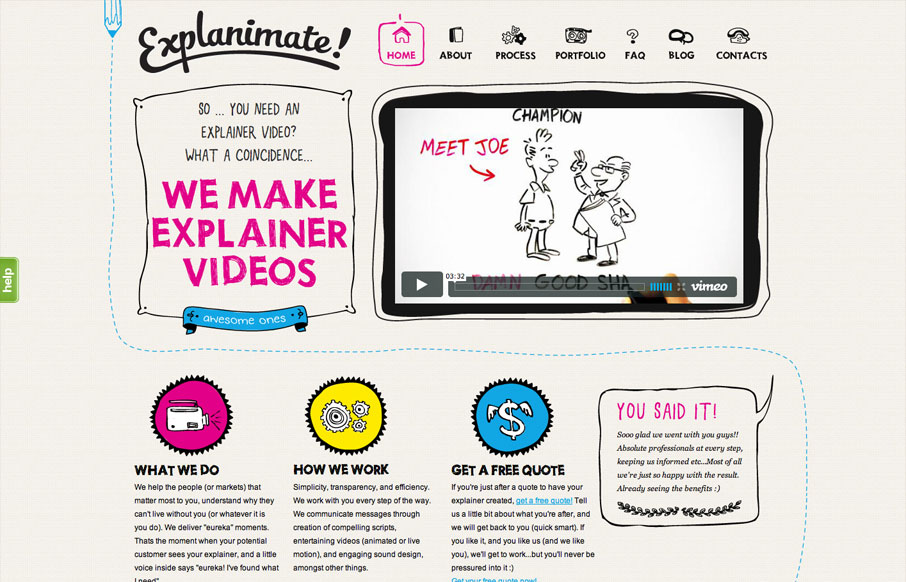
by Gene Crawford | Aug 6, 2012 | Gallery, Marketing
The website is built visually around what these guys do as a service. They illustrate what your product or service does, so they use that same skill on their own stuff. Very fun and open feel. Simple colors and type all work in tandem together like it should....

by Giovanni DiFeterici | Aug 6, 2012 | Gallery
I really like the simple typography and strong asymmetrical composition of mangrove.com. The site has a minimal, but judicious application of color that leaves plenty of room for their content. Coupled with simple, yet sophisticated interactions, mangrove.com is the...

by Giovanni DiFeterici | Aug 3, 2012 | Gallery
Damn, this is a cool site. Mixture of multiple illustration styles is awesome, as is the overall experience. liftinteractive.com has everything. The typography is tight and varied (if maybe a little uninspired), and structured beautifully. The interactions are...
