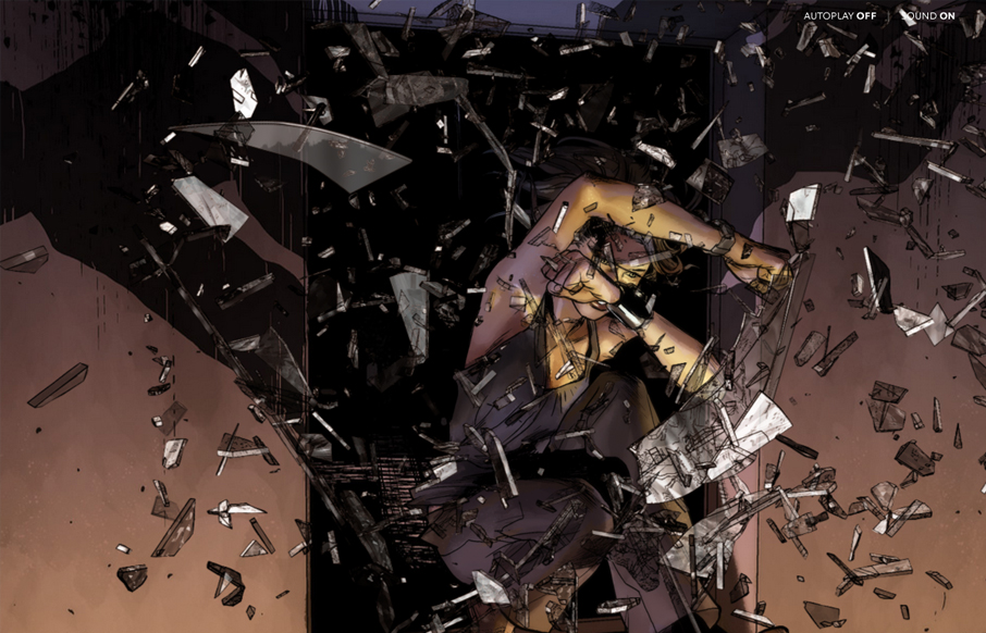
by Giovanni DiFeterici | Mar 11, 2013 | Entertainment, Gallery
I’ve always been a fan of comic books and graphic novels. I’m also a huge fan of experimental projects that push the boundaries of what we think is possible with websites. Peugeot Hybrid4 is a perfect example of one of these sites. The artwork is gorgeous...
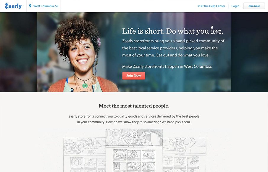
by Giovanni DiFeterici | Mar 11, 2013 | Gallery
zaarly.com has a soft elegant aesthetic that beautifully balances multiple styles. The open layout and dark grey type keep the design from feeling cluttered, even on site specific pages (like zaarly.com ). It’s a ‘no fluff’ design style doesn’t...
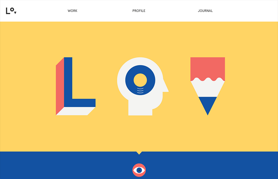
by Giovanni DiFeterici | Mar 8, 2013 | Gallery, Portfolio
lorenzoverzini.com is great. I love this site. Don’t get me wrong, it’s not the most groundbreaking design: minimal, super-flat, graphic, and spare. However, the balance of color, content and style is superb. I love the small SVG animations. They activate...
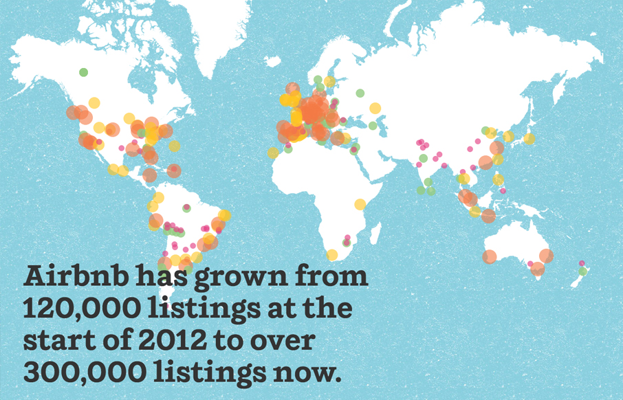
by Jay Barry | Mar 5, 2013 | Gallery
The annual report has long been something that companies use to not only give their shareholders information about how their business is doing, but it’s also often been used as a design showcase. That’s what airbnb, a sort of social house/vacation rental...
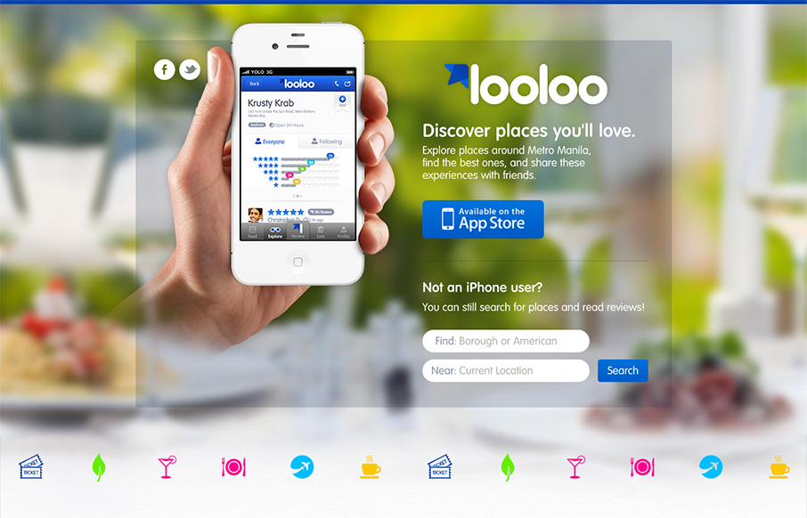
by Gene Crawford | Mar 5, 2013 | Gallery
Pretty solid iPhone app site. It’s pretty much just a single page design, you can search but generally it looks like an internal app page to me. Overall it is a solid design with some really nicely worked icon design. The overall design seems to fit into the app...