
by Giovanni DiFeterici | May 16, 2013 | Education, Gallery
This is about as beautiful a timeline as I’ve ever seen. The content is presented clearly and concisely. It’s linear presentation is perfect for telling a story and the mix of images, video, and text creates a rhythm that punctuates the high points of...

by Giovanni DiFeterici | May 15, 2013 | Gallery
Hopskoch is joyful and simple. It’s subtle animations are perfectly appropriate for selling the brand and pair nicely with the easter color palette. I really dig how the main product image scrolls up a little and fades out as you scroll down the page and the...
by Gene Crawford | May 13, 2013 | Gallery
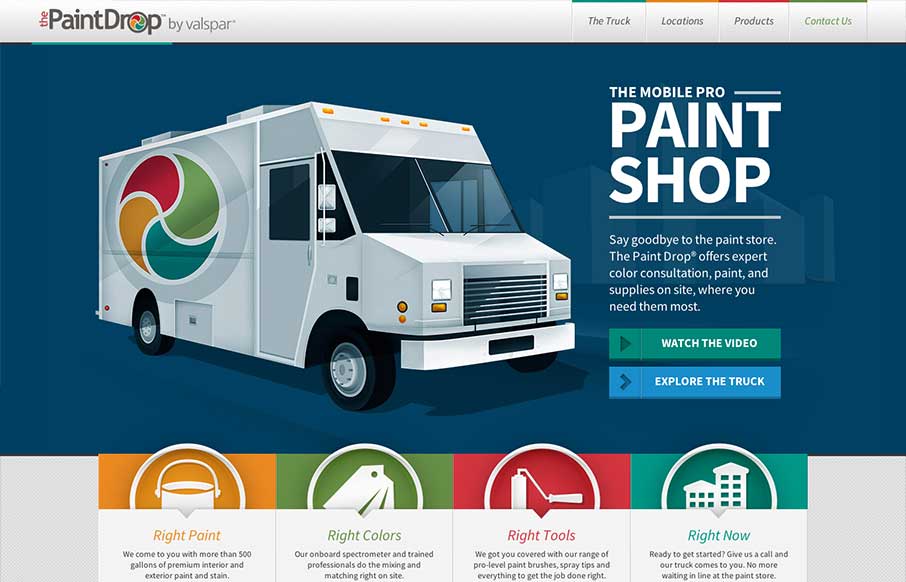
Website by Viget The Paint Drop is a paint store on wheels offering color consultation, paint and supplies on site. Whew! What a finely crafted visual design and executed website for Valspar. I love the responsive design decisions and how that’s been executed....
by Giovanni DiFeterici | May 13, 2013 | Gallery
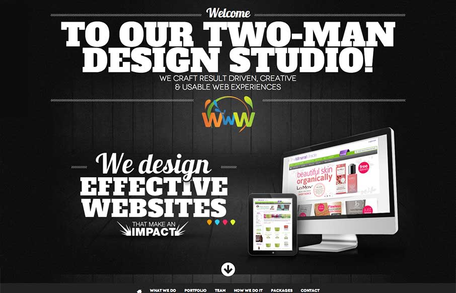
vibesdesign is a site that takes bold typography to an extreme. The site has a simple structure and minimal interactions, both of which I like, and places character and content in the forefront. Every ‘page’ has a custom layout, which keeps the long,...
by Maria | May 8, 2013 | Gallery
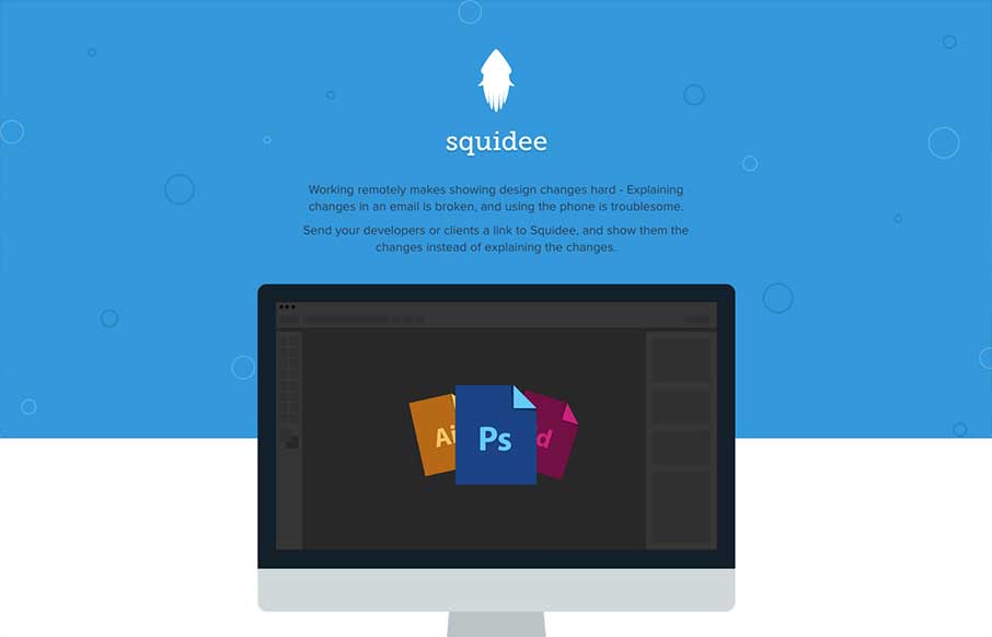
Squidee helps designers send PSDs to frontend developers. The aesthetic of this site is pretty nice. There’s a very clean use of shape and color which is balanced nicely with the amount and prominence of the type. I like the progression of content, and I dig the...
