by Gene Crawford | Aug 9, 2012 | Gallery
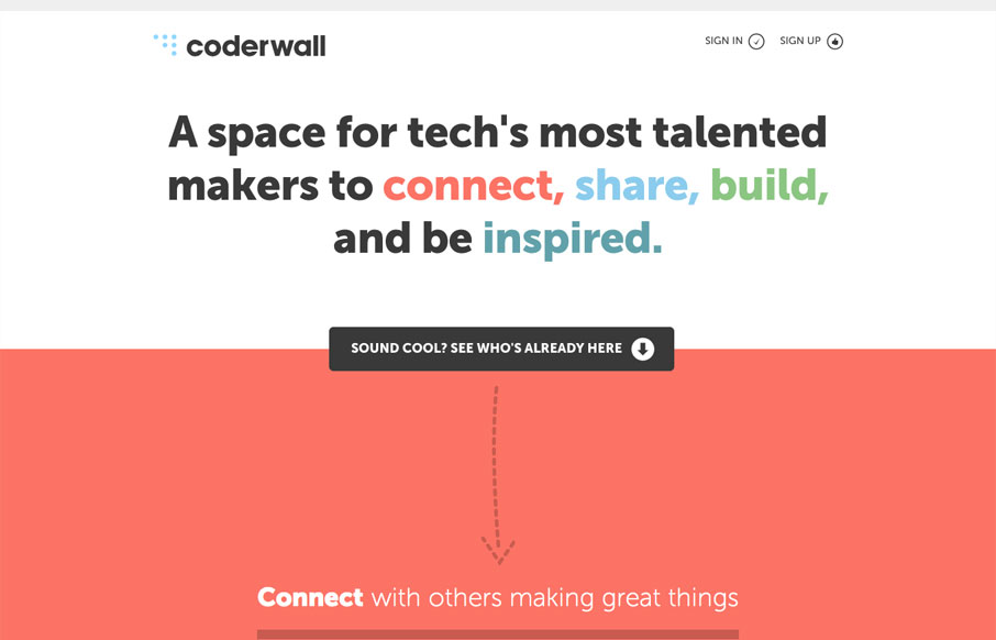
The coderwall website is a pretty simple, single page website. I really dig it because of this simplicity. It does what it needs to do fast, it uses other people in the industry that you already know to show you who’s using it as well as grouping with other...
by Gene Crawford | Aug 6, 2012 | Gallery, Marketing
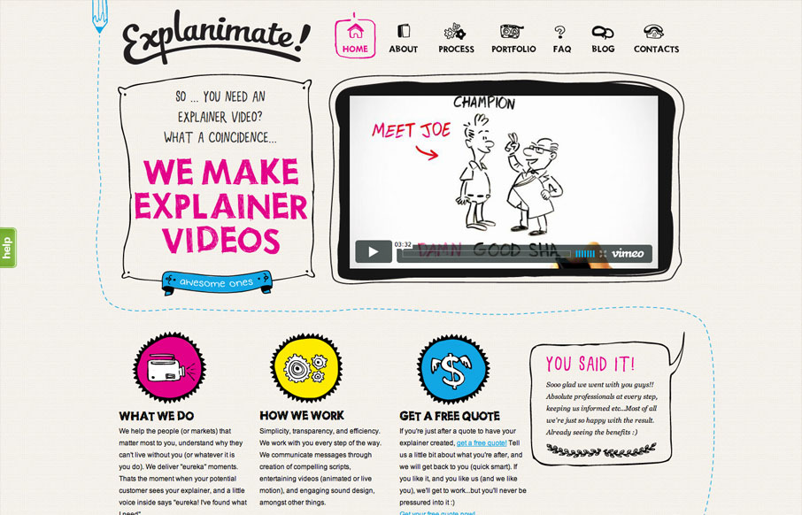
The website is built visually around what these guys do as a service. They illustrate what your product or service does, so they use that same skill on their own stuff. Very fun and open feel. Simple colors and type all work in tandem together like it should....

by Giovanni DiFeterici | Aug 6, 2012 | Gallery
I really like the simple typography and strong asymmetrical composition of mangrove.com. The site has a minimal, but judicious application of color that leaves plenty of room for their content. Coupled with simple, yet sophisticated interactions, mangrove.com is the...

by Gene Crawford | Aug 1, 2012 | Gallery
Really nice simple yet deep looking layout for the Inspect Element website. I really like how the main nav sort of hides under the page as you scroll down, that’s a small detail but it makes you really notice it. Then the simple feeling 2 column layout with...
by Gene Crawford | Aug 1, 2012 | Gallery
The animated slideshow is very cool. It’s the thing that makes you pay attention to this site. Then the action on the fixed navigation as you scroll down has added impact. The home page is jammed with content and graphics and there is a ton of content across the...