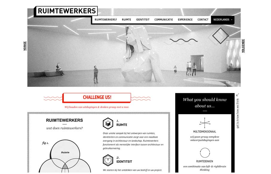
by Gene Crawford | Feb 28, 2014 | Design Firm, Gallery
I like the stark black and white box design of this website. Very simple and clean yet it almost feels gritty due to the way the boxes are used. That fixed nav section is pretty slick. I like how it just folds down to “nav” for mobile screen widths...

by Gene Crawford | Feb 26, 2014 | Gallery
Neat app site design. I really like how the top navigation comes from the bottom(ish) of the space you see after the initial home page area loads. Sliding up to take it’s place at the top of the page. Then the slight parallax behind each screenshot, then how you...

by Gene Crawford | Feb 26, 2014 | Gallery
Beautiful redesign of the Engine Yard website. What I like to read most is that they focused on the content first and dug into what people needed to get out of the website before any sort of fanciness. We also dug deep into our site and found what worked for visitors...

by Giovanni DiFeterici | Feb 25, 2014 | Gallery
Beoplay’s H3 site site is truly beautiful. I’m often against the practice of hijacking the user’s ability to scroll, but the effect works really well on this site. Every ‘page’ is clean and minimal, but provides a very different user...
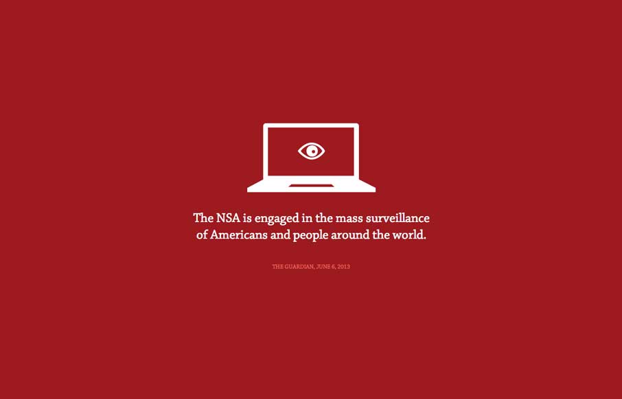
by Gene Crawford | Feb 24, 2014 | Gallery
The Now Way NSA page is largely a big infographic/news piece. It’s worth a look through other than to review the design of it, but the design of it is great. Now go and get enraged at the NSA.