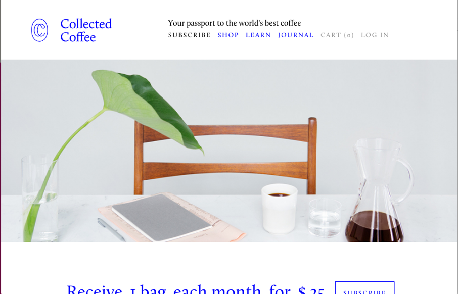
by Gene Crawford | Jul 13, 2016 | Food and Beverage, Gallery
I love the delicate approach to this design. From the typography to the way the illustrations are done and objects are placed on the page. Beautiful comes to mind.
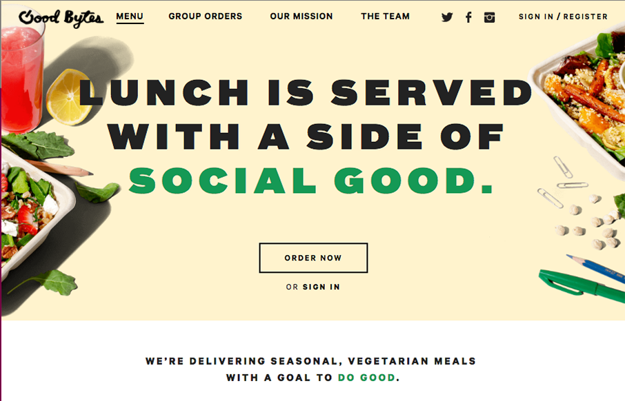
by Gene Crawford | Jul 13, 2016 | Food and Beverage, Gallery
Nice layout for Good Bytes Box. I dig the long scroll-y page with the centered icons. Good stuff.
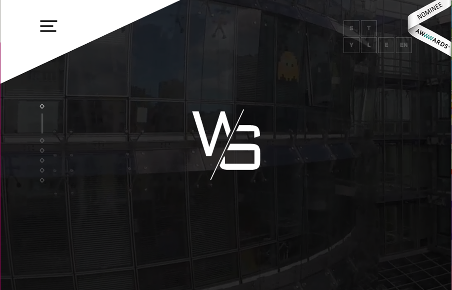
by Gene Crawford | Jul 12, 2016 | Gallery
Some really nifty and intense looking visual interactions for the Website Style site. I dig the muted (black and white) visual look as well as the long scrolling page with tons of detail work. Solid looking work. The experience gained during our previous realizations...

by Gene Crawford | Jul 11, 2016 | Gallery
This Studio 19 website is in the gallery because of the screen to screen transitions. Pretty sweet stuff there. I’m not sure it’ll work for a lot of generalized design usage but here it’s a cool tough.
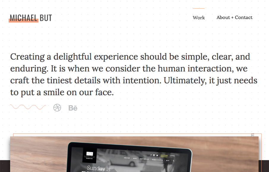
by Gene Crawford | Jul 8, 2016 | Gallery, Portfolio
Beautiful portfolio site that does just what it needs to do and not much more. Visually it’s very classy and professional looking. I also dig that he mainly sends you to Dribbble and Behance to see more work and connect professionally. From the Designer: A...