by Gene Crawford | Jul 7, 2016 | Design Firm, Gallery
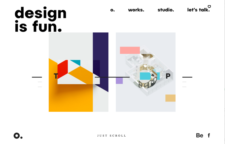
Pretty unique take on an agency website look. It feels very experimental in it’s approach to relaying content. I love that the most about it. Good effort there to keep it fresh and approachable at the same time. It’s also a nice visual design too. From the...

by Gene Crawford | Jul 6, 2016 | Gallery, Portfolio
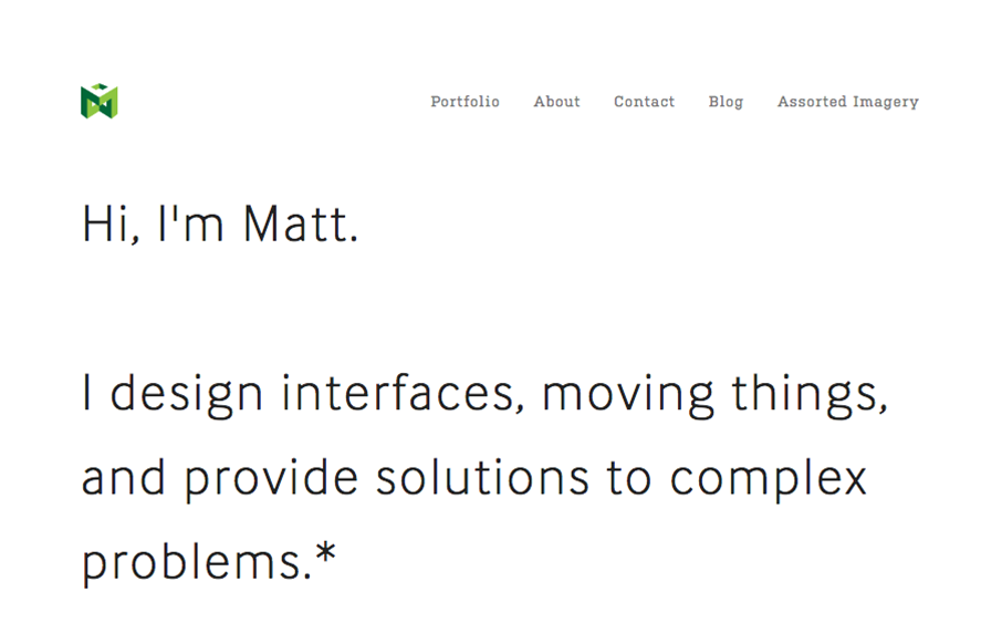
I love this portfolio site for Matt Welch. “Most complex problems come with an NDA”, amen brother. I love that he just puts that up front for you to know. It’s the truth, if you do any sort of high-level work your public portfolio is going to be...

by Gene Crawford | Jul 5, 2016 | Blog, Gallery
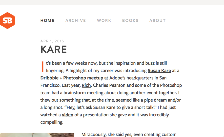
I’m not entirely sure how old or new this version of SimpleBits is. But it’s simply beautiful. Simple, straight forward and editorial based design. The perfect blog look. Mmmm hmmmm.

by Gene Crawford | Jun 29, 2016 | Gallery
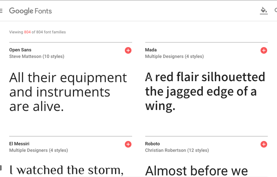
The Google Fonts site has needed a facelift for a while now. Well, it got one. Pretty damn slick too. You can type directly on top of the sample text and sorting is quite easy. Beautiful website let alone the type sampling work done. Solid.

by Gene Crawford | Jun 27, 2016 | Entertainment, Gallery
I’m digging the Charlie Rose website. There is a lot of pretty solid UX to study here. From the grid layout and display of episodes to the search form. Tip top design here.
