
by Gene Crawford | Jul 23, 2012 | Gallery
God I love this website. It’s so full of sweet little details and then awesome features like ‘method’ page. The project planner form is a real piece of work too, I love interactions in the multiple choice section and the price range slider. Spend...

by Gene Crawford | Jul 23, 2012 | Design Firm, Gallery
Really love the parallaxy effect with the background images and the main text/copy on the home page it makes a nice stark difference between the home and sub pages. THe use of different colors for each sub page is nice overall design decision too. The website feels...

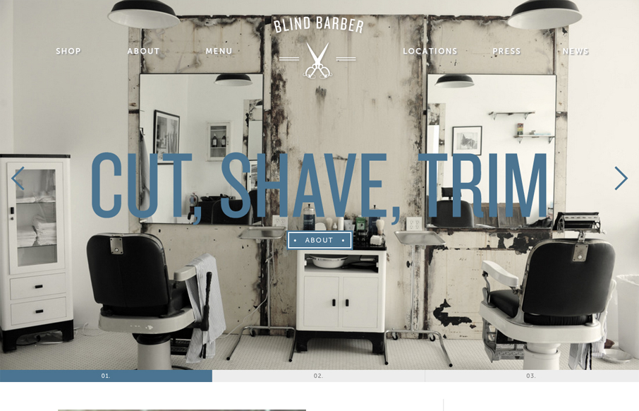
by Gene Crawford | Jul 23, 2012 | Gallery
Very thorough design. Overall the layout is engaging and crisp then the detail work is top-notch. From the interactions on the navigation and logo, the way the main navigation bar fixes itself in place as you scroll down and fades in and out. I also really like how...

by Gene Crawford | Jul 20, 2012 | Gallery
Nice asymmetrical layout, I really think the larger photo/work shot really helps bring a sense of focus to that section below the gray background/header area. The type is nicely treated visually and there is a solid rhythm as you scroll down the site. I don’t...
by Gene Crawford | Jul 19, 2012 | Gallery
For once I almost like a loading screen, it doesn’t take too long on this site which is good but it’s entertaining too. I think the monochromatic color scheme pulled out of the main photos and just the single blue. I also dig how the slider is done with...