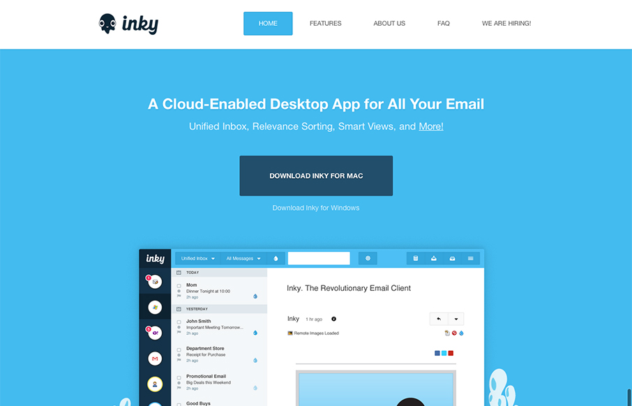
by Gene Crawford | Jan 9, 2013 | Gallery, Software
Pretty cool looking email app. Aside from that, the site design is a nice example of putting the full narrative from screenshot down to FAQ type content. I like how it flows both copy and visually.
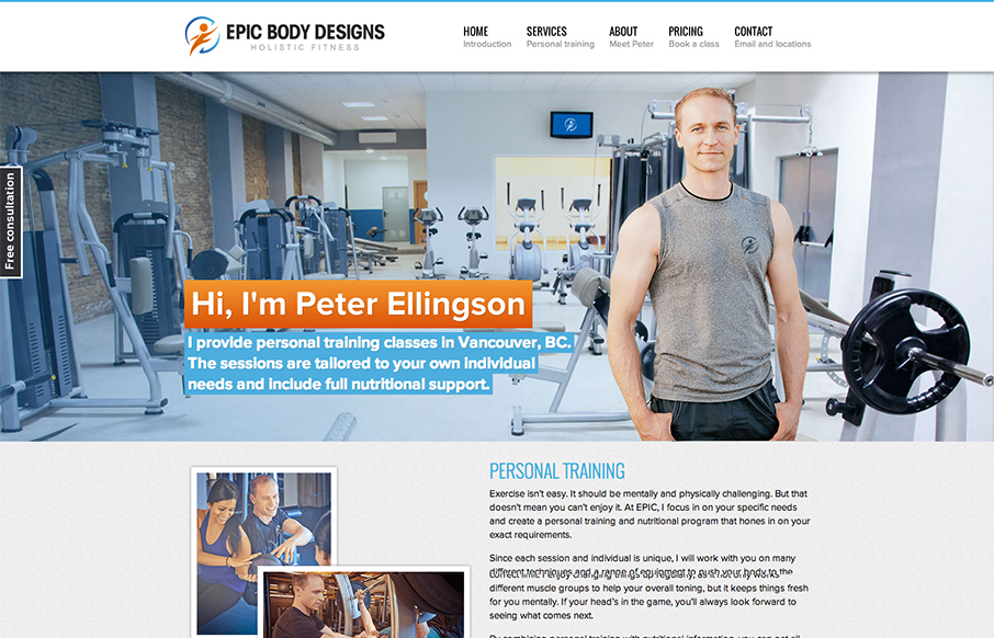
by Gene Crawford | Jan 8, 2013 | Gallery
I love when I see a non-designer website that’s as good looking as a web designer’s portfolio design. Like the site here for Epic Body Designs. It employs a lot of the typical design solution stuff we see on other designer’s portfolio sites or web...
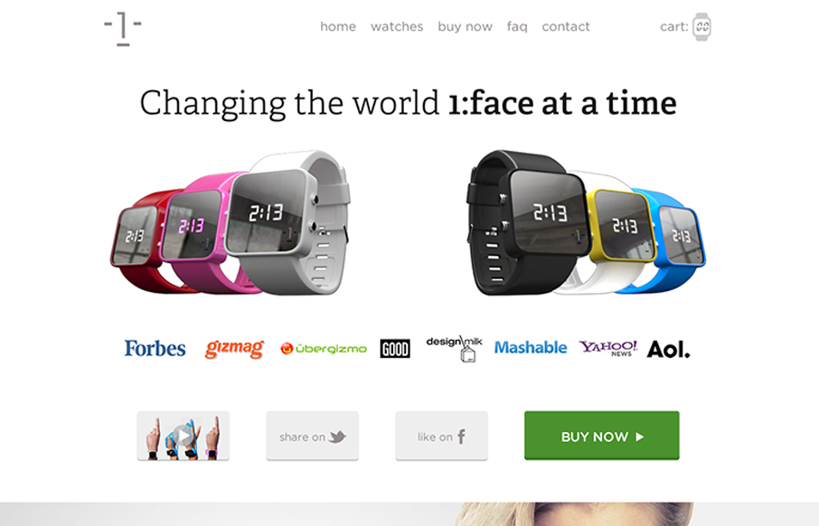
by Gene Crawford | Jan 8, 2013 | Gallery, Shopping
I dig the long scrolling page approach of the 1:Face Watch website. The photography is inspired IMHO and the other smart move was putting a “purchase” call to action next to every section of the page.
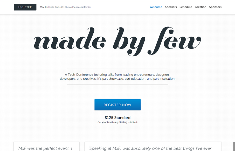
by Gene Crawford | Jan 8, 2013 | Gallery
The Made By Few site employs a nice fairly minimal design. I like the blue for the call to action and the other black, white and grey helps to make other details like the speakers images really stand out. I like the progressive loading as you scroll too. Capped off...

by Gene Crawford | Jan 7, 2013 | Education, Gallery
The @happycog-designed responsive redesign of delval.edu is seriously stunning. Love. /via @zeldman— Responsive Design (@RWD) December 19, 2012 I love the visual style of this site. It’s blocky and squared off and generally feels very graphic. I dig the...