
by Gene Crawford | Jan 7, 2013 | Gallery, Marketing
Beautiful design from a great company.pro.buysellads.com— allan branch (@allanbranch) December 20, 2012 Like Allan said, this design is beautiful. I like the vertical spacing of the elements, the clean color palette, the clear narrative of what BySellAds Pro is...

by Gene Crawford | Jan 7, 2013 | Gallery
It’s a pretty standard design, big hero image, slider, long scrolling page. But what this design does well is rhythm, from the top nav bar down to the footer it just sings to me visually. I like how it goes from heavy dark background to light, do clean icons...
by Gene Crawford | Jan 4, 2013 | Gallery
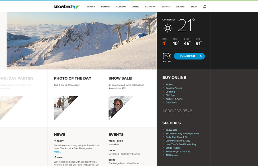
Well that’s a nice looking’ site. snowbird.com via @alliwagner— Chris Coyier (@chriscoyier) December 11, 2012 Agreed, it’s an amazing experience as you use it. The interactions are spot on and even more it’s fun to use. That’s...
by Gene Crawford | Jan 4, 2013 | Gallery, Music
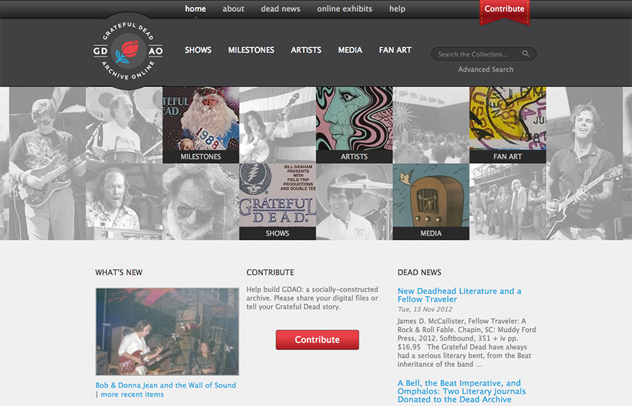
Went to gdao.org & time got away from me. What a wonderfully done site. One of my favorites.— Samantha Warren (@SamanthaToy) January 1, 2013 The thing I most like about this site is it’s information design. There’s a ton of stuff here to slog...
by Gene Crawford | Jan 3, 2013 | Gallery
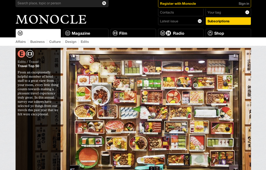
The new Monocle design is smart and sleekly crisp. I really love the header interaction design. It goes from full height to small and sticky very fluidly. Then the asymmetrical feel to the broken up grid of story blocks as you make your way scrolling down the home...