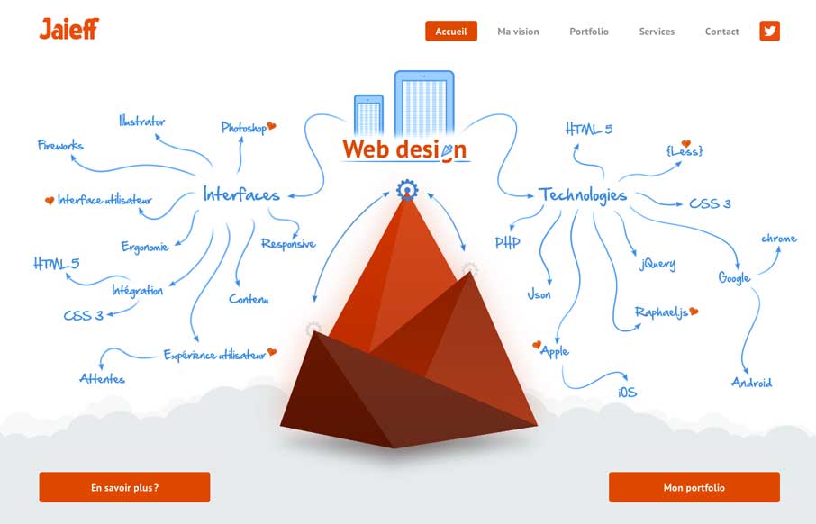
by Gene Crawford | Mar 7, 2014 | Gallery
There’s a lot to like about this website. But the best part is the interactive illustration on the home page. It’s pretty fun to mouse over that little gear and get all the arrows and stuff to show up. Also check it out on smaller screen widths, the stuff...
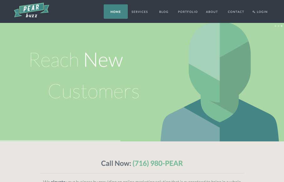
by Gene Crawford | Mar 4, 2014 | Gallery, Marketing
Love the colors and icon/illustration work on this site. The layout is pretty formulaic by design trend standards but sometimes that’s okay and with well designed elements you can really make things sing.
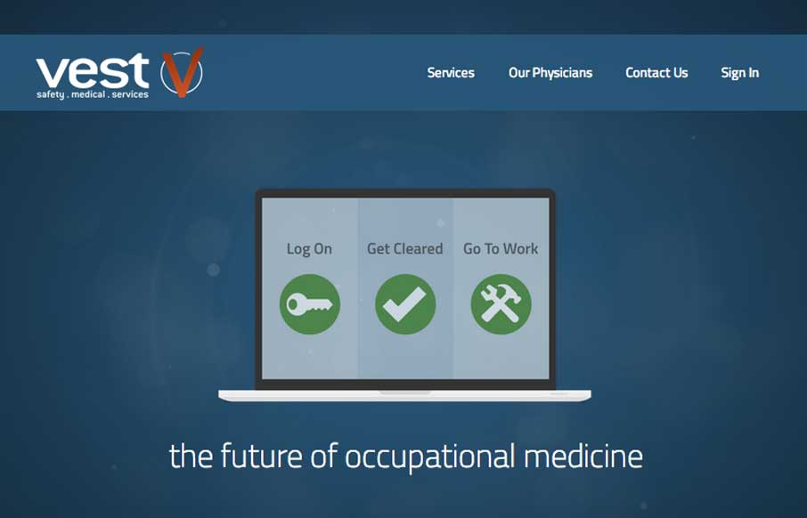
by Giovanni DiFeterici | Mar 3, 2014 | Gallery, Medical
Vest provides a really nice loading experience, considering it is a site that transfers 1.4MB when loaded. The main view loads a simple graphic and then loads in the heavier images whenever they are a available. The effect is something like a load screen that...
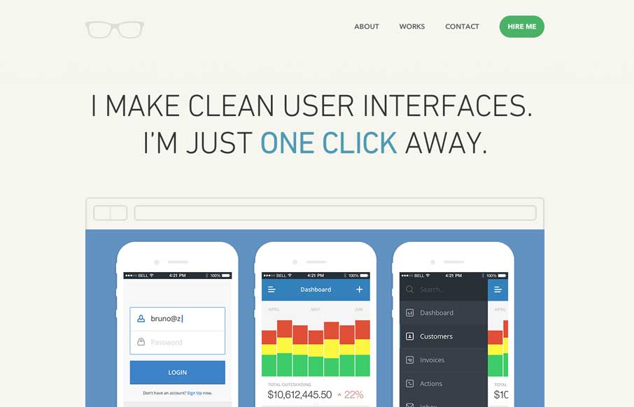
by Gene Crawford | Mar 3, 2014 | Gallery
Really simple minimal approach done well. I like the logo, then to see it used again on top of the guy’s self-portrait illustration. Nice simple layout that let’s me see the work really fast while looking engaging at the same time.
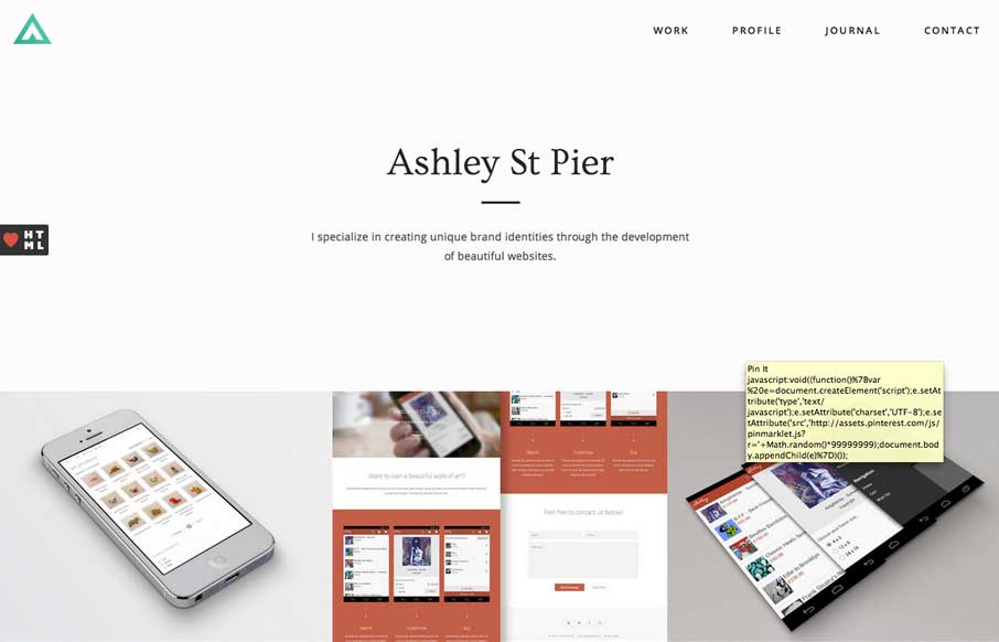
by Giovanni DiFeterici | Mar 3, 2014 | Gallery, Portfolio
Ashleystpier.com is big and beautiful. This kid is drinking the minimal Kool-Aid and it is working. Very nice portfolio site with minimal detailing and superb balance.