by Gene Crawford | Feb 28, 2014 | Design Firm, Gallery
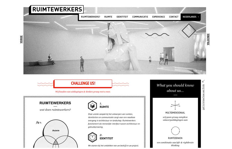
I like the stark black and white box design of this website. Very simple and clean yet it almost feels gritty due to the way the boxes are used. That fixed nav section is pretty slick. I like how it just folds down to “nav” for mobile screen widths...

by Gene Crawford | Feb 27, 2014 | Gallery
I really like the overall simplicity in this design. It get’s you to the point really really fast. I think it boarders on being too subtle at times, but that’s not always a bad thing 🙂 I love the visual rhythm in the work page the most. They could keep...

by Maria | Feb 27, 2014 | Gallery
You see these nice responsive sites with their sticky nav and circular images and slick transitions and think, “Yeah, that’s cool, they did everything right.” I’ll be honest, you don’t typically see this much content loaded in and still...

by Gene Crawford | Feb 26, 2014 | Gallery
Beautiful redesign of the Engine Yard website. What I like to read most is that they focused on the content first and dug into what people needed to get out of the website before any sort of fanciness. We also dug deep into our site and found what worked for visitors...

by Giovanni DiFeterici | Feb 26, 2014 | Gallery
The We Are Mammoth website is a simple site that feels tight and focused in content, clear in message and definitive in style. Not much more to say. Good stuff.
