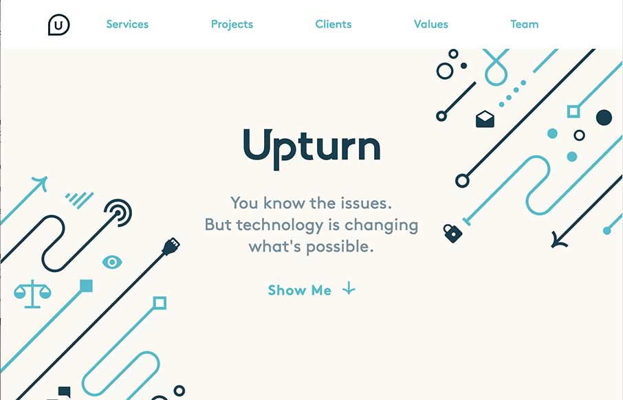
by Aaron Griswold | Mar 26, 2015 | Gallery, Social Cause
Nice work for good causes. Love the design and the simple art work on the Upturn site out of Washington DC. Great SVG work and animation, but still a simple and clean site. I would suggest to change the underlined words to bold or something else so they don’t...

by Aaron Griswold | Mar 26, 2015 | Gallery, Portfolio
Cool, quick portfolio one pager from Mukesh Suthar out of India. Of course love the Rubik’s Cube preloader – good movement through the rest of the site between the sliders and skill counters. Like the way he has the faceted search on the Work section too...
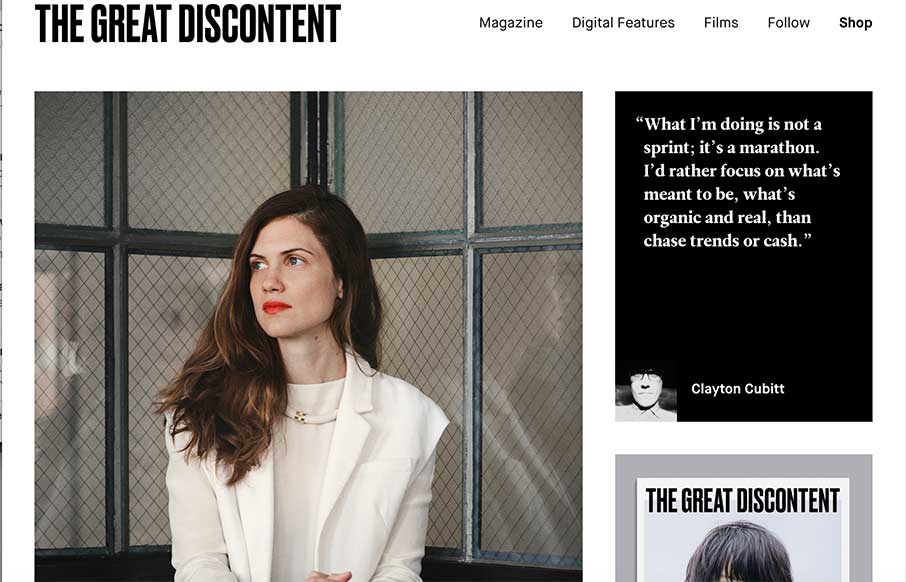
by Russ Pate | Mar 26, 2015 | Gallery
Simple, robust and impactful. Since 2011, this is how I’ve described The Great Discontent, both in its design and its quality long form articles. Every year or so they push out an [almost] invisible update to their site that seems to improve upon an experience...

by Aaron Griswold | Mar 25, 2015 | Gallery, Marketing Company
I like how Acara Partners, out of Connecticut, uses their home page image background to be a secondary navigation – cutting straight to what they do. The site is text heavy and icon rich – and that works more for a biz strat / marketing company (their two...
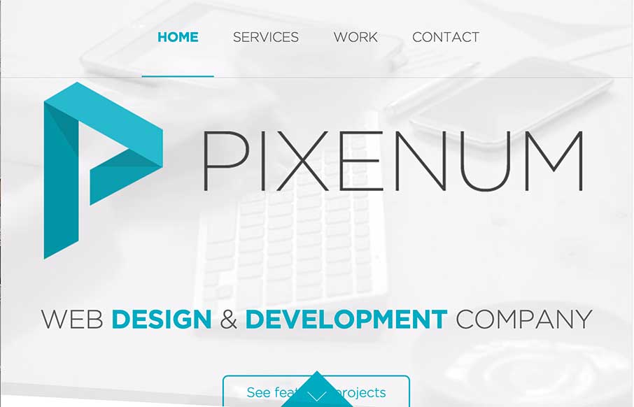
by Aaron Griswold | Mar 25, 2015 | Design Firm, Gallery
We’re starting to see more and more one pagers – especially from start up agencies / freelancers. Pixenum out of Croatia is one of these sites, and it’s a good one. Good web design is not only about the look and feel – it should also be about...