by Gene Crawford | Jan 13, 2015 | Gallery
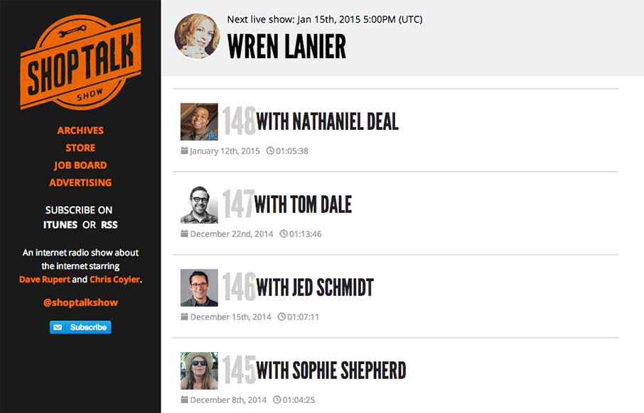
The new Shop Talk Show website is up. Retaining the same branding and colors but very much looks like it just goes straight for mobile users. Likely a very smart move. The content is in the audio and getting people to that fast not in showing off a super slick site...
by Aaron Griswold | Jan 9, 2015 | Gallery, Nonprofit
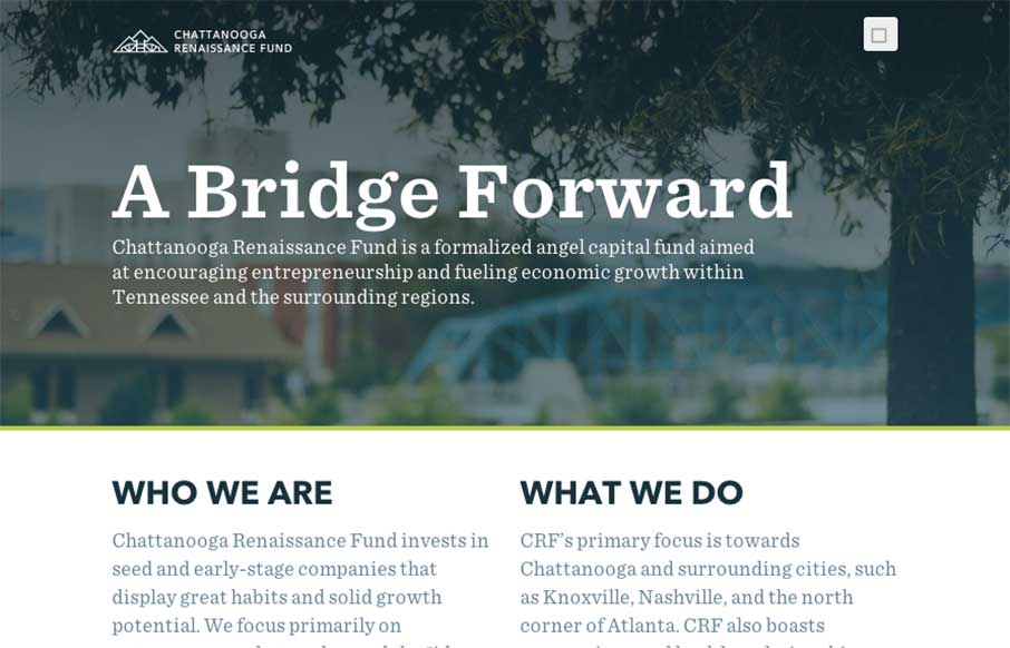
Good way to end the week. The Chattanooga Renaissance Fund’s site has great sweeping full-width shots and video backgrounds of Chattanooga that is fun just to look at from a design perspective. Especially like the footer image. Also like the vertical type on the...
by Gene Crawford | Jan 7, 2015 | Gallery, Portfolio
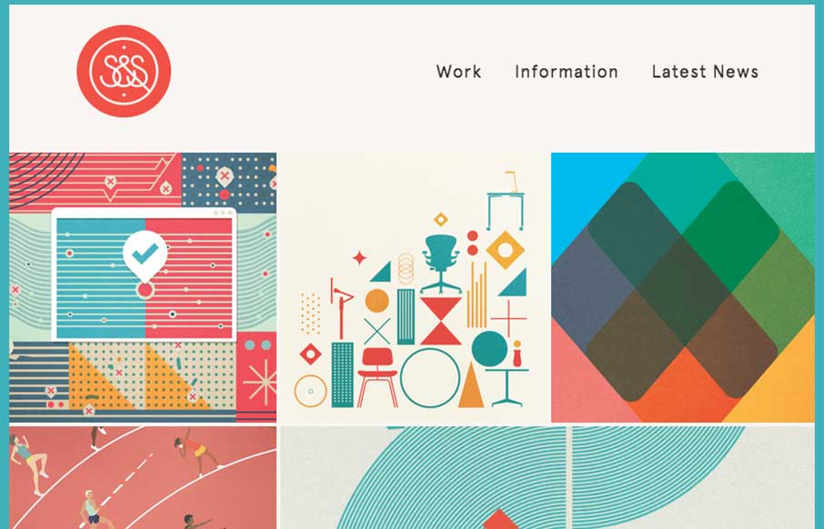
Nice Masonry/Isotope type responsive effect here. Actually, digging into the code looks like it is Isotope… I like the usage of it here because it just feels a little different. Especially with the way the logo overlays on top of the images like that too as you...
by Gene Crawford | Jan 7, 2015 | Gallery, Marketing Company
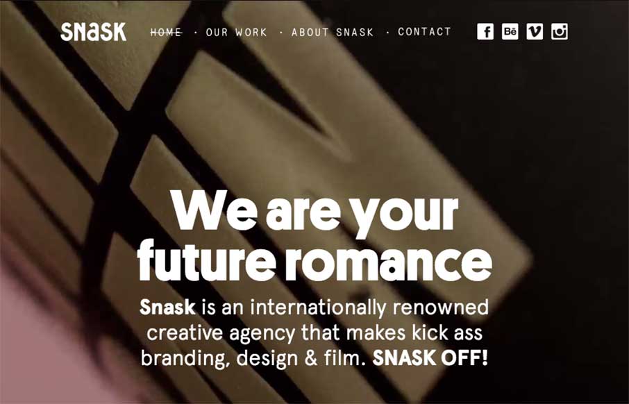
Some fairly straightforward design queues here on the Snask site. But I really really love the way the images are placed on the page. They just feel like they’re embedded in the page somehow to me. Kinda like a nice offset printed page feels. Know what I mean?...
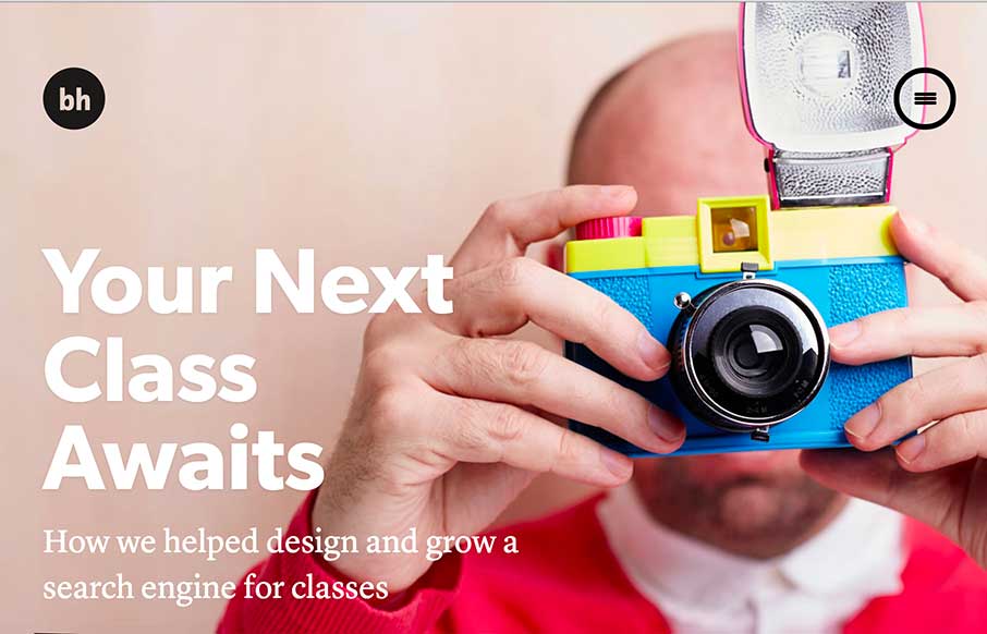
by Gene Crawford | Jan 6, 2015 | Gallery, Portfolio
There are so many details that make up Brian Hoff’s new site I don’t know where to start. First off it’s minimal at first glance which is what drew me in, then as you click around you start to discover there’s some really rich content there...